
Product updates
Stay up to date with the latest improvements, new features, and what’s coming next.
- 243 Product updates
Knowledge Center
Browse articles, step-by-step guides, and product how-tos.
Public Release Calendar
Releases and updates on our public cloud services.
Private Release Calendar
Releases and updates on our private cloud services.
SharePoint Intranet Calendar
Releases and updates on our private cloud services.
Q2 Release
Appspace 2602 Carina Platform Release Notes
The Appspace 2602 Carina Platform release notes deliver new features, improvements, and maintenance updates for core Appspace platform services. Select a release below to view its detailed release notes.
Q2 Release Continued
Appspace 2602 Carina Platform Release Notes
Q3 Release
Appspace 2603 Platform Release Notes
Explore Appspace 2603, featuring platform-wide Insights Assistant, Offline Mode for frontline teams, enhanced Visitor Management customization, and a modernized Device Tasks experience for managing devices at scale.
Jun 3, 2026
Appspace SharePoint Intranet 5.3 release notes
The Appspace SharePoint Intranet 5.3 release notes contain valuable information on the latest features, enhancements, bug fixes, and resolved escalations available in each public cloud release. In this release:Appspace SharePoint Intranet (5.3) Appspace SharePoint Intranet Issues Hotfixes Resolved Customer Issues The following is the release management schedule as per our Release Calendar for Appspace SharePoint Intranet:New Appspace SharePoint Intranet functionality and major platform optimizations will now be released under quarterly release cycle. Critical updates including security patches or emergency fixes that support the reliability and availability of the Appspace platform will be deployed as necessary and as soon as it is administratively feasible.ImportantFor previous Public Cloud release notes, please refer to the following: Appspace SharePoint Intranet 5.2 Release Notes Appspace SharePoint Intranet 5.1 Release Notes Appspace SharePoint Intranet 5.0 Release Notes Appspace SharePoint Intranet 4.16 Release Notes 5 June 2026Appspace SharePoint Intranet (5.3) Microsoft Changes / Deprecations & Product UpdatesTo ensure the platform remains secure and up-to-date, some functionalities are being affected or deprecated in this release due to ongoing changes within the Microsoft ecosystem. We are working on smooth transitions, but you may notice changes in how certain integrations or older features work. We highly recommend reviewing your current setups to ensure continued operation and to take advantage of the modern alternatives Microsoft recommends. NEW FEATURES & UPDATES Carousel Auto-play Controls (Hero & Apps) Technical Info: SharePoint Intranet: Hero The Hero carousel now includes a visible Pause/Play toggle button, giving users full control over automatic slide rotation. Pause/Play toggle — Hero carousel A clearly visible Pause/Play button appears on the Hero carousel. When the carousel is running, the button displays Pause. When stopped, it displays Play. The user's chosen state persists for the duration of the page session. Apps carousel The auto-rotation animation has been removed from the Apps page carousel. Users navigate between apps using the directional arrows. Keyboard and screen reader support The Pause/Play button is fully operable via keyboard (Tab to focus, Enter or Space to activate). The button carries a descriptive label that reflects the action it will perform, ensuring screen reader users understand the current state. Editor Improvements Technical Info: SharePoint Intranet: Editor Enhancements SharePoint Intranet: Text Editor Features This release includes several improvements to the Appspace SharePoint Intranet editor, providing a more reliable and consistent authoring experience when creating and managing content. Links Handling Improvements have been made to how links are handled within the editor, providing a more reliable and consistent experience when inserting, editing, and managing hyperlinks in content. Editor Tools Unification The Toggle and Callout block types are now available across all supported content types, including Stories, Standalone Blogs, Blogs, and Sites. This unifies the editor toolset and gives content creators a consistent authoring experience regardless of the content type they are working in. Tooltips in Inline Toolbar Tooltips have been added to the inline editor toolbar, providing descriptive labels for each formatting option. This improves discoverability and usability for new and experienced content authors alike. Drag & Drop Functionality Improvements Drag and drop behavior within the editor has been enhanced for greater reliability and precision. Users can now reposition content blocks, images, and other elements more smoothly during content creation and editing. Reorder Columns & Rows within a Table Authors can now reorder columns and rows within tables directly in the editor, removing the need to delete and recreate table structures when reorganizing content. Add or Remove Single Images in Image Galleries on Sites Authors can now add or remove individual images from an image gallery on Sites without having to replace the entire gallery. This provides greater flexibility when managing visual content on site pages. Data Export Functionality for Editorial Settings Dashboard Technical Info: SharePoint Intranet: Export Data Building on the export capabilities introduced in version 5.2, this release extends data export functionality across additional areas of the Manage Spaces Dashboard and Editorial Settings. Global Admins and Global Editorial Managers can export datasets as timestamped CSV files for reporting, auditing, and planning purposes. Manage Spaces — spaces data Global Admins can export a complete, unfiltered dataset of all enabled spaces — including Sites, Blogs, and Communities — as a timestamped CSV file. Organizational structure Global Admins and Global Editorial Managers can export the full organizational structure — all nodes and sites — as a CSV file that reflects the hierarchical relationships between items. The export includes the title and description for every node and site. Snippets An Export button is available on the Snippets Dashboard, positioned in the top right corner and consistent in style with the Tags and Audiences pages. Clicking the button opens a dropdown menu with export options. The button is visible only to users with Admin or Editorial Manager permissions. Tags An Export button appears on the main Tags page and triggers an immediate CSV download containing all tags in the system, regardless of source. The export includes three columns: Title, Source (e.g., Activities, Communities, Pages, Stories), and Entity (the specific object the tag is linked to). The Export button is hidden when a search or filter is active, and reappears when the full list is restored. Audiences An Export button is available on the Audiences management page, positioned alongside the New Category button and consistent in style with other export controls across the platform. The export includes all audiences in a flat, filterable format (one row per audience), maintaining the two-level Category > Audience hierarchy. Columns include the parent category, the audience name, the AD groups assigned to the audience, and the list of individually targeted users. Apps Global Admins, Global Editorial Managers, and Local Entity Admins can export app data from the Editorial Settings App pages. Two export types are available: a detailed app inventory with metadata for auditing and ownership tracking, and a summary of app counts per category for high-level reporting across entities. Simplify Process to Request Membership in Moderated Communities Joining a moderated or restricted community now requires fewer steps for both members and community owners. Members can: Click a single Request Membership button within the community to submit a join request. Receive an automatic notification confirming whether their request was approved or declined. Gain immediate access to the community upon approval, with no further action required. Community owners can: Receive an automatic notification — by email or in-app — when a user requests membership, including the user's name and profile link. Approve or decline the request directly from the notification, without navigating to a separate page. Applies to: Moderated and Restricted communities. Community Wiki Versioning Community wiki pages now support version history, consistent with the versioning already available for Pages, Stories, and Community Blogs. Wiki authors and community owners can: View the full version history of any published wiki, including the date, time, and author of each saved version. Preview any previous version in read-only mode. Restore a previous version by loading its title and body content back into the editor. The restored content must be saved to become the new published version, which is then logged as the next version in the history. Version tracking scope: A new version is created only when a published wiki's title or body content is updated and saved. Changes to files, tags, or other metadata do not trigger a new version. Drafts and unpublished content do not generate version history. If no published versions exist yet, the Version History panel displays a No history available message. Access: Version history is visible only to the wiki author and community owners with edit permissions. Regular users cannot access it. Accessibility – Accessible Images in Comments Users can now add or edit alternative text (alt text) for images attached to posted comments, ensuring image content is accessible to screen reader users across all activity types. Users can: Access an Add Alt Text option from the three-dot menu on any comment that contains images. The option appears after See Translation and before Report. Add or edit descriptive alt text for each image in the comment via a dedicated modal. If alt text already exists, the input field pre-populates with the current value. Save changes directly from the modal. The alt text is permanently associated with the image and applied as the HTML alt attribute wherever the image is displayed. Applies to comments on: Updates, Events, Praises, Wikis, Blogs, and Files across Activities (Newsfeeds, Communities, and My Profile), Stories, Pages, and Standalone Blog posts. Keyboard and screen reader support: The Add Alt Text trigger is fully keyboard-operable (Tab to focus, Enter or Space to activate). Focus moves into the modal on open, is trapped while the modal is active, and returns to the trigger on close or Escape. Screen readers announce the modal purpose on open, the input field label, and the updated alt text when navigating past the image after saving. Classic to Modern Transition Continued migration of legacy publishing pages to the modern Single-Page Application (SPA) architecture. This release includes updates to Standalone Wiki and Community Wiki root and page publishing views, along with upgrade paths for existing wiki content. Appspace SharePoint Intranet Issues HotfixesBZP-29771: Spotlight People searches now display the complete set of relevant results instead of limiting the list to eight people. BZP-29764: Community blog posts now retain and display their content correctly after upgrading to Appspace Intranet 5.2. BZP-29311: Weekly Digest links now open the correct pages when their URLs contain umlauts or other supported special characters.Resolved Customer IssuesBZP-29074: Fixed low text contrast on the “community to share with” information element so the text is easier to read and meets accessibility expectations. BZP-29070: Added the missing HTML language attribute to translated content so browsers and screen readers can identify the correct language. BZP-29009: Fixed the Decline button on the Notification page so its hover and keyboard focus states meet color contrast requirements. BZP-28971: Fixed an error that appeared in the Hero announcement pop-up when using a specific publishing workflow. BZP-28943: Improved the contrast between unselected year labels and the sidebar background so the labels are easier to see. BZP-28904: Fixed an issue where Community Owners could edit polls, events, questions, and blogs created by others even when the “Owners can edit others’ activities” setting was disabled. BZP-28885: Fixed the Newsfeed layout breakpoint so the Sharebox and three-column zone behave correctly on the Startpage. BZP-28881: Added an accessible name to the community delete button so screen readers can correctly identify the bin icon action. BZP-28794: Fixed the My Favorites configuration page so app search results display complete information instead of showing only the entity. BZP-28701: Fixed the ShareBox Poll behavior so keyboard focus moves correctly after a poll option is removed. BZP-28691: Improved the Join/Leave button so screen readers announce the “You have joined...” state correctly. BZP-28688: Updated the “Play video” button so it announces the video title and gives users better context. BZP-28685: Improved the search box label so screen readers clearly identify it as a search field. BZP-28684: Fixed an issue on Workplace mobile where favorite apps after the 12th item were not responsive. BZP-28683: Improved the “Find out more” banner link so it includes descriptive context, such as the related banner or story title. BZP-28682: Updated the banner close button label so screen readers announce a clearer action, such as “Close banner.” BZP-28680: Fixed the Configure My Apps modal so NVDA no longer announces the Done button twice. BZP-28679: Updated the Communities filter component to use the correct tab role instead of links, improving accessibility semantics. BZP-28678: Fixed the Restricted User label on public profiles so it is announced as static text instead of a clickable button. BZP-28676: Improved the contrast of the banner close icon so it remains visible against different backgrounds. BZP-28675: Improved the focused “Yes, delete” button state so the text has sufficient contrast. BZP-28550: Fixed localized newsfeed wording so the View Older Activities button displays the correct translated Load More Activity text. BZP-28547: Added appropriate language tagging to auto-translated tag content for better accessibility support. BZP-28542: Added an accessible name to the Vote and Results button on My Profile. BZP-28540: Fixed focus behavior after selecting Load More so users are taken to the newly loaded content. BZP-28537: Fixed screen reader behavior so it announces the intended link text instead of reading the full URL. BZP-28513: Improved the contextual search box so screen reader users receive clearer context and instructions. BZP-28398: Fixed the “Open link in new tab” toggle so it correctly changes position when switched. BZP-28270: Fixed the Terms and Conditions pop-up so the Terms and Conditions link is not incorrectly highlighted when the checkbox is selected or cleared. BZP-28228: Corrected misleading status information for assistive technology users. BZP-28098: Improved Standalone Blog sidebar filters so screen reader and visual feedback clearly indicate when the feed has been filtered. BZP-28053: Fixed an issue where background content changed while a menu panel remained expanded. BZP-28027: Improved long posts with the Show More option so screen readers do not announce the entire post at once. BZP-27923: Fixed the Add a Tag select box in the “What are you working on” section so it remains operable when opened from View My Profile. BZP-27502: Fixed activity card text shifting when browser zoom is set to 110% or 125%. BZP-25802: Fixed Community Blog draft deletion so deleted draft blog posts are also removed from the SharePoint backend. BZP-25258: Fixed notification announcements so screen readers do not announce notifications before the user focuses on the bell icon. BZP-20926: Fixed Pages and Stories translation lists so more than 20 enabled languages can be displayed as available translations. BZP-7571: Fixed tags containing symbols so they can be followed. BZP-27051: Fixed copied editor components, such as tables, callouts, and toggle lists, so copied items no longer remain linked while editing. BZP-28635: Improved the “What are you working on” Sharebox so screen readers announce the expected message when the modal opens. BZP-27353: Improved screen reader support when accessing Recommend in a Community. BZP-28564: Fixed Standalone Blog tag titles so long titles are fully visible. BZP-28590: Added the missing visual cue for notification categories when there are no notifications on screen. BZP-28627: Fixed Pages Narrow Down filter tag behavior so interaction no longer causes a full page refresh, focus loss, or repeated announcements. BZP-26966: Improved public table accessibility by adding proper table header support, making complex tables easier to navigate with screen readers and keyboards. BZP-27650: Refactored table semantics so tables are accessible to screen reader and keyboard users. BZP-28480: Improved the Hero slider so screen readers announce story information correctly. BZP-28560: Fixed the community content sorting element so it is keyboard accessible. BZP-15287: Added an assertive ARIA live announcement when an app is removed from favorites in the Configure Apps modal. BZP-28626: Fixed Pages activity filter tags so they no longer reload the page on each interaction or cause focus loss, incorrect roles, and missing state information. BZP-28246: Fixed Spotlight Search behavior where results from another site collection on the same tenant could lead to a blank screen or access denied page.
Related products:SharePoint Intranet
Jun 1, 2026
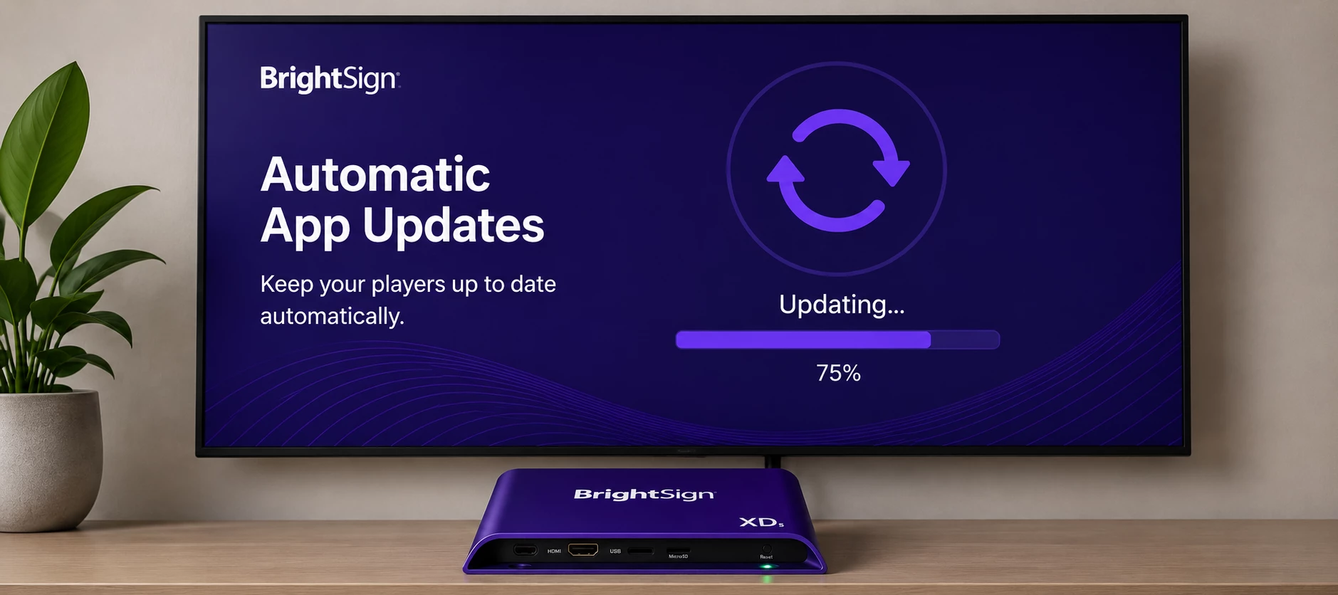
Reminder: Keep Your BrightSign Players Up to Date with Automatic App Updates
Keeping your BrightSign players up to date helps ensure they receive the latest Appspace enhancements, security improvements, and bug fixes.BrightSign App updates require an opt-in setting. If automatic updates are not enabled, your players may continue running older versions of the Appspace App and miss important improvements. Check Your BrightSign Software Update Setting To receive Appspace App updates automatically, make sure the Software Updates toggle is enabled for your BrightSign players.When this setting is enabled, BrightSign devices can automatically download and install approved Appspace App updates.Note: Once your device's app version is updated to 2.92 and platform version is updated to 2601.4.0, the BrightSign App Updater device task will no longer work, and you will be instructed to use the Automatic/Manual scheduled Software Updates.Why this mattersStay current with the latest Appspace features. Receive important updates for security, stability, and performance. Reduce manual maintenance by limiting the need for hands-on updates. Keep deployments consistent across your BrightSign device network. Need Help? Use the step-by-step guide Simplify Your BrightSign Deployment: A Step-by-Step Guide to Configuring Software Updates to verify and enable software updates on your BrightSign players. The guide walks through the configuration process so you can confirm that your players are set up to receive approved Appspace App updates automatically. Take a Minute to Verify Your Settings If you have not reviewed your BrightSign update settings recently, now is a good time to confirm that Software Updates is enabled.This small setting helps your devices stay current and continue benefiting from the latest Appspace improvements.
Related products:BrightSign
May 29, 2026
Appspace 2602.4.0 Release Notes
Appspace 2602.4.0 delivers image focal points, Qbic device support, and reservation checkpoint improvements.Preview: May 29, 2026 Public Cloud: June 26, 2026 Private Cloud: July 7, 2026 In this releaseIntranet Digital Signage Space Reservation Appendix Intranet Feature Description Affects Focal Point Support for Image Thumbnails Communicators can set a focal point for content library images so the most important part of each image stays visible when thumbnails, banners, social cards, content cards, media galleries, and space headers crop or resize the image. Communicator Digital Signage Feature Description Affects Qbic Device Type IT Admins can manage Qbic devices as a supported device type in the Devices module. Registered Qbic devices display the correct device type and branding in device lists and device details, and Qbic can be selected when configuring Device Task templates. IT Admin Space Reservation Feature Description Affects Required Checkpoint Completion Remote Workers must complete required checkpoints during the reservation process before continuing. This helps organizers, delegatees, and concierge users complete the required steps when creating or managing reservations. Remote Worker Appendix Release SchedulesFor detailed release management schedules, please refer to the Appspace Release Calendars:Public Cloud: Public Cloud Release Calendar Private Cloud: Private Cloud Release Calendar
Related products:Q2 2026 Carina 2602
May 29, 2026
Appspace 2602.2.6 Release Notes
Appspace 2602.2.6 delivers improvements to Intranet, Digital Signage, and Platform.Public Cloud: May 26, 2026 Maintenance Release Platform Improvement Details Ticket Device Usage Reporting Device usage data now returns consistently for affected accounts. AE-14658 Intranet Improvement Details Ticket AI Page and Story Builder Reliability The AI Page and Story Builder now handles longer generation sessions and saves article updates more reliably. AP-66782 Digital Signage Improvement Details Ticket Power BI Dashboard Playback Power BI dashboards now render correctly on BrightSign players during device playback. AP-66840 Playlist Publishing Performance Playlist publishing lookups now handle large user and audience memberships more efficiently, improving reliability during device-filtered playlist requests. AE-14439 Appendix Release SchedulesFor detailed release management schedules, please refer to the Appspace Release Calendars:Public Cloud: Public Cloud Release Calendar Private Cloud: Private Cloud Release Calendar
Related products:Q2 2026 Carina 2602
May 29, 2026
Appspace 2602.2.7 Release Notes
Appspace 2602.2.7 delivers improvements to Space Reservation concierge order views.Public Cloud: May 29, 2026 Maintenance Release Space Reservation Improvement Details Ticket Ancillary Order Visibility Ancillary orders now remain visible in the concierge order view when related location data needs to be refreshed. Orders can be recovered and displayed correctly after the related location information is updated. AE-14660 Appendix Release SchedulesFor detailed release management schedules, please refer to the Appspace Release Calendars:Public Cloud: Public Cloud Release Calendar Private Cloud: Private Cloud Release Calendar
Related products:Q2 2026 Carina 2602
May 29, 2026
Appspace 2602.1.14 Release Notes
Appspace 2602.1.14 delivers Power BI playback fixes and publishing stability improvements.Private Cloud: May 25, 2026 Maintenance Release Platform Improvement Details Ticket Publishing Stability Improvements Publishing operations now process large user and audience lookups more efficiently to improve system stability during high-volume playlist publishing activity. Administrators can expect more consistent publishing performance across large environments. AE-14439 Digital Signage Improvement Details Ticket Power BI Dashboard Playback Power BI dashboards now display correctly on BrightSign devices during playback. Dashboard updates and rendering behavior are now more consistent across supported signage devices. AP-66842 Appendix Release SchedulesFor detailed release management schedules, please refer to the Appspace Release Calendars:Public Cloud: Public Cloud Release Calendar Private Cloud: Private Cloud Release Calendar
Related products:Q2 2026 Carina 2602 PV
May 26, 2026
Appspace 2602.3.4 Release Notes
Appspace 2602.3.4 delivers improvements to Platform, Intranet, and Digital Signage.Public Cloud: May 26, 2026 Maintenance Release Platform Improvement Details Ticket Device Usage Reporting Device usage data now uses the correct platform response, improving consistency for device-related reporting. AE-14658 Insights Access for Location Admins Location Admins can now open Insights dashboards from the sidebar when they have the required access. AE-14644 Webhook Synchronization Webhook configuration changes now synchronize in the expected direction when updated through the platform API. AP-66559 SharePoint Connection Cleanup SharePoint-connected libraries now handle deleted connections more reliably, preventing repeated sync attempts from disconnected sources. AP-66323 SharePoint File Sync SharePoint-connected communities now handle file moves, folder updates, and media downloads more reliably for permitted users. AP-65800 Intranet Improvement Details Ticket Card Translation Access The translation button now remains available when users create Generate cards, so teams can continue translating content from the editor. AP-66815 AI Page and Story Builder Stability AI-assisted page and story creation now handles required fields, value limits, pattern requirements, and save activity more consistently. AP-66796 AskAI Sharebox Prompt The AskAI Write anything option now opens correctly from the sharebox, allowing users to enter a prompt without closing the composer. AP-66630 Admin Theme Display Admin pages now display the correct admin theme colors instead of applying Employee App theme colors. AP-66601 Branding Setup Logo Company logos uploaded during first-time branding setup now save correctly and display in the Employee App and brand settings. AP-66483 Hero Banner Editing Admins can now save updates to Hero Banner media blocks while keeping existing images attached. AP-66391 Shortcut Widget Images Shortcut widget images now display correctly, and widget changes can be saved as expected. AP-66290 Home Theme Saving Home themes with custom or system widgets now save correctly. AP-66889 Hero Banner Media Previously uploaded Hero Banner media now remains available and displays correctly. AP-66291 Digital Signage Improvement Details Ticket Same-Day Schedule Saving Users can now save Digital Signage schedules when the start and end times are on the same day and the end time is later than the start time. AP-66833 Playlist Performance Channel playlist publishing now uses resources more efficiently, improving stability during high-volume playlist and device lookup activity. AP-66626 Power BI Dashboard Playback Power BI dashboards now render more reliably during device playback instead of showing only the Power BI logo. AP-66841 Channel Icon Saving Custom icons selected in Digital Signage channel settings now save and display correctly in channel listings and previews. AP-66656 Playlist Publishing Performance Playlist publishing lookups now reduce memory load during device-targeted publishing activity. AE-14439 Playlist Card Updates Updated cards now appear correctly in playlists and on devices after card content is changed. AP-66962 Appendix Release SchedulesFor detailed release management schedules, please refer to the Appspace Release Calendars:Public Cloud: Public Cloud Release Calendar Private Cloud: Private Cloud Release Calendar
Related products:Q2 2026 Carina 2602
May 25, 2026
Appspace 2602.3.3 Release Notes
Appspace 2602.3.3 delivers improvements to Intranet, Digital Signage, and Platform.Public Cloud: May 20, 2026 Maintenance Release Platform Improvement Details Ticket Content Cleanup Reliability Content cleanup now handles large cleanup jobs more reliably, reducing the chance of cleanup delays or performance spikes. AP-66354 Expired Content Cleanup Performance Expired content cleanup now runs more consistently and avoids repeated processing that could increase system load. AP-66587 Global Logo Deletion Deleted global logos now maintain consistent content metadata, so removed assets no longer leave inconsistent records behind. AE-14523 Intranet Improvement Details Ticket AI Experiences Appspace Intelligence and AI-assisted authoring now handle production requests more reliably across conversations, article building, and content variation syncs. AP-66545 User Profile Updates Users can now update profile fields even when the phone number field is left blank. AP-66480 Homepage Banner Widgets Existing banner widgets now preserve their content type settings and continue displaying content on the homepage after upgrades. AP-66471 Conversational AI Loading State Conversational AI now displays the current action label while processing a request, giving users clearer feedback during loading. AP-66609 Community and Channel Settings Icons Community and channel settings icons now display correctly in design settings. AP-66577 Feed Location Filters Newsfeed, Hero Banner, and Featured Posts widgets now respect configured feed location filters when displaying posts. AP-66495 Comment Reply Button The Reply button now appears consistently when users type comments in the Employee App. AP-66407 Digital Signage Improvement Details Ticket Device Overview Access Published devices in a channel's Publish tab can now be selected to open the device overview. AP-66424 Updated Card Playback Updated cards now sync and display correctly on devices after a playlist channel is updated. AP-66615 Signage Channel Icons Playlist icons now display correctly in the Create Signage Channel dialog and Settings tab. AP-66496 Dayparting Schedules Exclusive and normal schedules with dayparting now follow the configured schedule windows correctly. AP-66494 Playlist Schedule Timing Playlist schedule start times now display and play according to the configured local schedule. AP-66426 Device Content Sync The Content tab on the device overview page now reflects edited card content from signage channels. AP-66401 AppendixRelease SchedulesFor detailed release management schedules, please refer to the Appspace Release Calendars:Public Cloud: Public Cloud Release Calendar Private Cloud: Private Cloud Release Calendar
Related products:Q2 2026 Carina 2602
May 25, 2026
Appspace 2602.3.1 Release Notes
Appspace 2602.3.1 delivers improvements to Platform, Intranet, and Digital Signage.Public Cloud: May 16, 2026 Maintenance Release Platform Improvement Details Ticket User Group Settings User group settings now load correctly so admins can configure JIT custom groups. AP-66455 SCIM User Provisioning SCIM provisioning now handles stale Entra user references correctly, allowing Entra ID to continue matching and creating users. AE-14026 Duplicate Email Handling Duplicate email records are now cleaned up so users can sign in to the correct account. AP-66114 User Service Reliability User service message processing now handles connection errors more reliably across supported environments. AP-66087 Brand Setup Updates Brand setup changes, including logo updates, now apply consistently after setup is rerun. AP-66085 Device Task Deployment Device task deployments now complete successfully when the user session is scoped below the account root. AP-66023 Intranet Improvement Details Ticket SharePoint Intranet Passport Creation SharePoint Intranet passports can now be created successfully. AP-66375 Newsletter Rendering from Hero Banner Newsletters now retain formatting and images when opened from a hero banner. AP-66237 Card Translations Card translations now remain available after the card name is changed. AE-14227 Custom Widget Lists Custom widget lists and Add Widget dropdowns now display all available active custom widgets instead of stopping at the first 20. AP-66154 Theme Homepage Banner Widgets Existing banner widgets now retain their content type and display correctly on theme homepages. AP-66139 Embedded Videos in Social Posts Embedded videos in social posts now play correctly on Android when users tap the play button. AP-65931 Hero Banner Carousel Layout Hero Banner carousel cards now keep surrounding content from overlapping the banner area. AP-66348 Page and Story File Names Pages and stories now display the correct file name after creation. AP-66339 Newsfeed Widget Filters Newsfeed widgets now honor the Newsletter post type filter and show only matching newsletter content. AP-66260 Recent Feeds Widget Filters Recent Feeds widgets now follow configured feed type filters for communities, topics, and channels. AP-66236 Employee App Media Banners Media banners now display correctly on the Employee App home page. AP-66046 Web Frame Widget Padding Web Frame widgets now keep consistent left and right padding on mobile in channels. AP-66030 Web Frame Widget User Parameters Web Frame widget URLs now replace user parameters correctly. AP-66015 Web Frame Widget Labels Web Frame widget sidebars now show translated labels instead of raw key names. AP-66012 Hero Banner Media Links Hero Banner media blocks now open configured links even when no title or overline is set. AE-14508 Newsletter Header Logo Handling Newsletter creation now handles header logo content more reliably so the create screen loads successfully. AE-14523 User Profile Photo Controls User profile photo controls now handle upload and removal correctly on web and mobile. AP-64568 Digital Signage Improvement Details Ticket Linked Signage Channel Sources Newly created signage channels can now be added and saved as linked sources. AP-66307 Channel Publish Device Status Published devices now show the correct status in the channel Publish tab and can be selected to open device overview. AP-66305 Advanced Channel Media Creation Advanced channels now create media and media zones successfully after media is uploaded in a template. AP-66406 Advanced Channel Icons Advanced channel icons can now be changed in settings without upload errors. AP-66399 Schedule Descriptions Schedule descriptions now save and remain visible when schedules are reopened. AP-65100 Exclusive Schedule Dayparting Exclusive schedules with dayparting now follow configured playback windows. AP-65099 Channel Listing Icons Channel icons now update correctly on the channel listing page after channel creation. AP-65098 Move Schedule Options The Move Schedule dropdown now lists valid destinations and moves schedules without a system error. AP-65096 Portrait Channel Resolution Portrait channel resolution now displays in the correct format. AP-65095 Exclusive Schedule Playback Exclusive schedules now override default playback during their scheduled window. AP-65093 Signage Channel Content Order Newly added signage channel content now appears at the top of the playlist. AP-65084 Device Overview Content Count Device Overview now shows the correct content count for devices assigned to a new signage channel in single-channel mode. AP-65081 Space Reservation Improvement Details Ticket Concierge Menu Cart Updates Concierge menu carts now update edited line items without duplicating items or inflating quantities. AE-14502 AppendixRelease SchedulesFor detailed release management schedules, please refer to the Appspace Release Calendars:Public Cloud: Public Cloud Release Calendar Private Cloud: Private Cloud Release Calendar
Related products:Q2 2026 Carina 2602
May 25, 2026
Appspace 2602.3.2 Release Notes
Appspace 2602.3.2 delivers improvements to Intranet and Digital Signage. Public Cloud: May 19, 2026 Maintenance Release Intranet Improvement Details Ticket User Notifications User notifications now skip empty recipient updates instead of creating repeated service errors. Notification updates continue to process normally when a valid recipient group exists. AP-66336 Digital Signage Improvement Details Ticket Playlist Updates Playlist updates now process more reliably during high-volume content changes. This improves playlist responsiveness and helps prevent update delays during large content migrations. AP-66337 Appendix Release SchedulesFor detailed release management schedules, please refer to the Appspace Release Calendars:Public Cloud: Public Cloud Release Calendar Private Cloud: Private Cloud Release Calendar
Related products:Q2 2026 Carina 2602
May 20, 2026
Appspace 2602.1.13 Release Notes
Appspace 2602.1.13 delivers improvements to the Subscription Overview dashboard and the concierge order view for Space Reservation.Private Cloud: 20 May 2026 Maintenance Release Platform Improvement Details Ticket Accurate Device Usage on Subscription Overview The Subscription Overview dashboard now reports the correct number of devices used against the account’s device allocation, giving administrators a reliable view of remaining device capacity when planning new deployments. AE-14658 Space Reservation Improvement Details Ticket Ancillary Orders Visible in Concierge View Ancillary orders attached to reservations consistently appear in the concierge order view across every location they relate to. Orders that previously could not be located by concierge staff are now recovered automatically and presented in the correct location filter. AE-14660 Appendix Release SchedulesFor detailed release management schedules, please refer to the Appspace Release Calendars:Public Cloud: Public Cloud Release Calendar Private Cloud: Private Cloud Release Calendar
Related products:Q2 2026 Carina 2602 PV
May 20, 2026
Appspace App 2.97 Release Notes for Devices & Built-In Apps
Appspace App 2.97 introduces Fire TV Back button navigation, smoother text ticker playback, and two maintenance fixes for device platforms.Release Date: May 20, 2026 Release Platform: Android · BrightSign · Chrome OS · Cisco Webex and CE · Crestron · Electron · IAdea · iOS · LG webOS · Linux Ubuntu · Logitech · macOS · MediaVue · Mersive · Poly · PWA · Samsung SSP Tizen · Windows · Windows UWP ImportantAppspace maintains a rolling 9-month support window. Bug fixes and security updates are applied exclusively to the latest release. Please ensure your devices stay within this window for continued support. Please refer to the Appspace Supported App Versions to learn more. New Features & Improvements App Features Description Affects Back Button Navigation on Amazon Fire TV Pressing the Back button on the Amazon Fire TV remote now opens a confirmation dialog asking whether to exit the Appspace App for Devices, with options to cancel and resume playback or to exit the app. Previously, the Back button had no standardised behaviour and could interrupt playback unexpectedly. IT Admin Employee Smoother Text Ticker Playback Text tickers now scroll smoothly and continuously, even while the device is loading or rendering other content. Previously, tickers could stutter or freeze briefly when device resources were under load. IT Admin Communicator BrightSign Series 6 HD and XS Certification The Appspace App is now certified for BrightSign HD1026 (firmware 9.1.82) and XS156 (firmware 9.1.32). IT Admin Communicator LG WebOS 8.0 Certification The Appspace App is now certified for LG webOS 8.0. IT Admin Communicator Maintenance Release Improvement Details Ticket Tizen 4 Update Reliability Samsung SSP Tizen 4 devices now complete the update to the latest app version and resume playback normally, restoring a smooth in-place upgrade path for devices running earlier releases. APC-8345 LG webOS 8.0 App Launch The Appspace App now starts correctly and proceeds past the splash screen on LG webOS 8.0 devices, allowing content to load on first launch. APC-8321
Related products:AndroidBrightSignChrome OSCisco Webex and CECrestronElectronIAdeaiOSLG webOSLinux UbuntuLogitechmacOSMediaVueMersivePolyPWASamsung SSP TizenWindowsWindows UWP
May 19, 2026
Appspace 2602.1.12 Release Notes
Appspace 2602.1.12 delivers improvements to SCIM user provisioning for Private Cloud.Private Cloud: May 15, 2026 Maintenance Release Platform Improvement Details Ticket SCIM Empty GUID Handling The SCIM service now returns a 404 response for requests that reference an empty or non-existent user GUID. Microsoft Entra ID correctly interprets this response and resumes its user reconciliation flow, resolving provisioning workflows that were previously blocked. AE-14026 Appendix Release SchedulesFor detailed release management schedules, please refer to the Appspace Release Calendars:Public Cloud: Public Cloud Release Calendar Private Cloud: Private Cloud Release Calendar
Related products:Q2 2026 Carina 2602 PV
May 19, 2026
Appspace 2602.1.11 Release Notes
Appspace 2602.1.11 delivers improvements to device task deployments, card translations, and Concierge menu ordering.Private Cloud: May 13, 2026 Maintenance Release Platform Improvement Details Ticket Task Deployment for Sub-Root Sessions Task deployments now complete successfully when initiated by users whose session is set to a sub-root network. Previously, deployments were silently discarded and did not appear in any device task list. AP-66025 Intranet Improvement Details Ticket Card Translation Preservation Generated card translations are now retained when the card name is changed via the title field or the library context menu. Previously, renaming a card caused all translation data to be lost. AE-14227 Space Reservation Improvement Details Ticket Concierge Menu Cart Accuracy Editing an existing menu order item now correctly replaces the original quantity and instructions without duplicating line items. Previously, editing a cart item could result in inflated counts or duplicate entries appearing in the cart. AE-14502 Appendix Release SchedulesFor detailed release management schedules, please refer to the Appspace Release Calendars:Public Cloud: Public Cloud Release Calendar Private Cloud: Private Cloud Release Calendar
Related products:Q2 2026 Carina 2602 PV
May 19, 2026
Appspace 2602.1.10 Release Notes
Appspace 2602.1.10 delivers improvements to platform stability.Private Cloud: May 8, 2026 Maintenance Release Platform Improvement Details Ticket User Service Stability The platform user service now handles internal messaging connections more reliably. Intermittent connectivity errors that could affect service availability are resolved. AP-66084 Appendix Release SchedulesFor detailed release management schedules, please refer to the Appspace Release Calendars:Public Cloud: Public Cloud Release Calendar Private Cloud: Private Cloud Release Calendar
Related products:Q2 2026 Carina 2602 PV
May 18, 2026
Appspace 2602.2.4 Release Notes
Appspace 2602.2.4 delivers improvements to AI service reliability, global logo management, and library service stability.Public Cloud: 18 May 2026 Maintenance Release Platform Improvement Details Ticket Global Logo Deletion Global logo deletion now correctly updates all associated content metadata, ensuring consistent state across library records after a logo is removed. AE-14523 Library Service Stability The expired content cleanup process now runs more efficiently, preventing excessive resource consumption during scheduled library maintenance operations. AP-66356 Intranet Improvement Details Ticket AI Feature Reliability AI-powered features in Conversations and Article Builder now operate more reliably. Improvements address connection stability, message processing, and variation sync in the Article Builder assistant. AP-66270 Appendix Release SchedulesFor detailed release management schedules, please refer to the Appspace Release Calendars:Public Cloud: Public Cloud Release Calendar Private Cloud: Private Cloud Release Calendar
Related products:Q2 2026 Carina 2602
May 18, 2026
Appspace 2602.2.2 Release Notes
Appspace 2602.2.2 delivers improvements to Platform stability, card translations, and Space Reservation ordering. Public Cloud: May 13, 2026Maintenance ReleasePlatformImprovement Details Ticket Task Deployment for Sub-Network Users Task deployments now complete correctly for administrators whose current session network is set below the account root. Deployments to device, location, and device group targets save and execute as expected regardless of the user's session network position in the hierarchy. AP-66022 Duplicate Email Account Resolution Users affected by duplicate email records created through SCIM provisioning can now sign in successfully. The most recently created account record is retained, and users are directed to the correct account on login. AP-65522 Private Cloud License Slot Enforcement License slot limits are now correctly enforced per organization on Private Cloud deployments. Organizations in multi-tenant environments can no longer consume more license slots than their allocated maximum. AP-65959 IntranetImprovement Details Ticket Card Translation Preservation on Rename Card translations are now preserved when a card title is renamed from the library or from the card editor preview. All configured language translations remain intact after a title change. AE-14227 Space ReservationImprovement Details Ticket Concierge Menu Cart Edit Accuracy The Concierge menu cart now correctly reflects updated item quantities and selections when an existing order is edited. Item counts and line entries accurately match the submitted quantities after editing. AE-14502 Appendix Release Schedules For detailed release management schedules, please refer to the Appspace Release Calendars: Public Cloud: Public Cloud Release Calendar Private Cloud: Private Cloud Release Calendar
Related products:Q2 2026 Carina 2602
May 8, 2026
Appspace 2602.2.1 Release Notes
Appspace 2602.2.1 delivers improvements to channel visibility, advanced channel actions, Space Reservation workflows, and checkpoint handling for approvers.Preview: May 8, 2026 Public Cloud: May 8, 2026 Maintenance Release Platform Improvement Details Ticket Appspace Intelligence Response Appspace Intelligence now responds reliably to messages sent from the AI chat in the employee app. AP-64974 Presence Status Refresh Availability and presence status now updates correctly and in real time for all users. AP-65041 Reservation Assistant in Spotlight Search The reservation assistant is now accessible when starting an AI chat from Spotlight search. AP-65509 Mobile App Logo Display The Appspace mobile app now displays the correct mobile-specific logo configured in Theme settings, independently of the web logo. AP-65210 Intranet Improvement Details Ticket Channel Visibility for User Groups Users assigned to a user group with publisher permissions now see all channels they have access to, correctly reflecting their group membership. AE-14505 Post Reply Mention Suggestions Mention suggestions in post replies now load on initial render and respond immediately as a user begins typing. AE-14430 Story Featured Option The Featured option in the story Settings panel is now enabled once a feed is selected under Published to, allowing communicators to mark stories as featured. AP-65354 Social Card Rendering Social cards now render correctly and display consistently within the channel layout. AP-65622 Digital Signage Improvement Details Ticket Advanced Channel Actions Actions on advanced channels now save and delete correctly. AE-14470 Space Reservation Improvement Details Ticket Reservation Check-In Status Reservations created within an open check-in window now transition correctly to Active status, even when a previous booking for the same resource had auto-cancelled. AE-14436 Concierge Service Order Visibility Service orders now display correctly in the concierge view regardless of whether the event organizer is listed as an attendee. AE-14468 Checkpoint Completion for Approvers Users with approver permissions can now complete service checkpoints on reservations they created. Optional checkpoints correctly omit the Checkpoints Required banner, and reservation status remains stable after a checkpoint is answered. AP-65234 Order Summary for Non-Attendee Organizers Order summaries now display correctly in both the Reservation and Concierge modules when the event organizer is not included in the attendee list. AP-65510 Calendar Event Sync with Approval Rules Events created in an external calendar for a resource with an approval rule now sync correctly and appear in Appspace as expected. AP-65546 Appendix Release SchedulesFor detailed release management schedules, please refer to the Appspace Release Calendars:Public Cloud: Public Cloud Release Calendar Private Cloud: Private Cloud Release Calendar
Related products:Q2 2026 Carina 2602
May 8, 2026
Appspace 2602.3.0 Release Notes
Appspace 2602.3.0 introduces audit log reporting and Appspace Intelligence in user profiles for Platform, AI-assisted authoring in Employee Communications, device-level translation and start-up URL controls for Digital Signage, time picker and approval workflow refinements for Space Reservation, and resource-level visitor invites for Visitor Management.Preview: May 8, 2026 Public Cloud: May 29, 2026 Private Cloud: June 9, 2026 In this releasePlatform Employee Communications Digital Signage Space Reservation Visitor Management Appendix Platform Feature What changed Affects Audit Log Reports Account owners can now pull audit log reports from Admin Console > Insights > Reports across six categories: User Management, Channel Management, Content Management, Employee App, Authentication, and Brand Management. This gives administrators a single place to review activity for compliance and security investigations. IT Admin Appspace Intelligence in User Profiles Appspace Intelligence is now integrated into the people discovery experience. Employees can type natural-language queries into Ask Appspace Intelligence to find colleagues, with results returned as clickable source cards that open matching profiles. Each opened profile shows a Suggested based on your search card explaining the match. Profile pages also include a floating Appspace Intelligence assistant that surfaces contextual prompts such as Find more people in this department, returning inline profile cards and a link to the People Directory. Employee IT Admin Employee Communications Feature What changed Affects AI Page and Story Builder Communicators can now draft fully structured Pages and Stories from a simple text prompt. Press the spacebar in the editor or open the Appspace Intelligence entry point to generate ready-to-edit content. The assistant retains conversational context across sessions, accepts document and media uploads as reference material, and can pull selected editor content into the chat for further refinement. Communicator AI Image Generation and Editing AI image capabilities are now available end-to-end across the Editor, Sharebox, and Feed Banner. Communicators can generate and edit images in context, batch-edit multiple images at once, choose image size and aspect ratio, supply a reference image to guide edits, and have the AI prompt auto-populate from highlighted content in the editor. Communicator Digital Signage Feature What changed Affects Device-Level Translation Language Configuration Administrators can now select which languages an individual device uses when playing back AI-generated cards. The new Translation Languages setting lives under Devices > [Device] > Settings > Configuration, beneath Software Updates, and supports all 33 Appspace languages. In Manual mode, administrators can pick any combination of languages and use Select All or Unselect All for convenience. In Inherited mode, the device displays the languages configured at its parent location and the selector is read-only. This setting applies to AI-generated cards only. IT Admin Device Start-Up URL Hidden by Default The Copy Device Start-Up URL option on the Device Overview page is now hidden by default. This prevents the start-up URL from being shared across multiple devices, which previously caused token claim failures and device registration issues. IT Admin Space Reservation Feature What changed Affects Time Picker Improvements in Places and the Reservation Panel The time picker dropdown in Places and the Reservation panel now displays a maximum of five options at a time. Limiting the visible items reduces visual clutter and makes time selection faster on smaller screens. Employee Remote Worker Visitor Management Feature What changed Affects Resource-Level Visitor Invites in the Outlook Add-In Hosts can now invite external visitors directly to a specific resource reservation from the Outlook Add-In, matching the behavior already available in Appspace. Previously, visitors could only be invited at the building level on the Building Pass. Communicator IT Admin Appendix Release schedule informationThe following is the release management schedule as per our Release Calendar for Public Cloud:New Appspace functionality and major platform optimizations are released under a quarterly release cycle, scheduled at 8:00 pm CST on Friday. Scheduled minor feature updates, cloud service optimizations, and bug and escalation fixes are typically scheduled at 8:00 pm CST throughout the week, typically on a Tuesday or Friday. Critical updates including security patches or emergency fixes that support the reliability and availability of the Appspace platform are deployed as necessary and as soon as administratively feasible.
Related products:Q2 2026 Carina 2602
Apr 27, 2026
Appspace App 2.96 Release Notes for Devices & Built-In Apps
Appspace App 2.96 introduces application-wide custom font support for BrightSign, full-resolution HLS streaming on Crestron, and 6 maintenance fixes for devices and built-in apps.Release date: April 28, 2026 Release Platform: Android · BrightSign · Crestron · iOS · PWA · Windows UWP ImportantAppspace maintains a rolling 9-month support window. Bug fixes and security updates are applied exclusively to the latest release. Please ensure your devices stay within this window for continued support. Please refer to the Appspace Device App Version Lifecycle Policy to learn more.Prior version release notes for Devices & Built-In Apps:Version 2.95 Version 2.94 Version 2.93 Version 2.92.1 Version 2.92 Version 2.91 Version 2.90 Versions 2.72-2.80Older versions are unsupported. New Features & Improvements App Features Description Affects Application-Wide Custom Font Support (BrightSign) Technical Info: Install Custom Fonts Application-Wide on BrightSign Devices Custom fonts on BrightSign devices now apply consistently across all content types, ensuring uniform typography application-wide. Because certain font file types can prevent BrightSign hardware from starting up correctly, custom fonts are no longer auto-installed. Administrators must now explicitly permit supported font types using a new device property: New property: device.font.supportedtypes Values: a comma-separated list of extensions (for example, ttf,otf,woff) To enable application-wide custom fonts, the following conditions must be met: The custom font must be successfully installed using the Appspace App: Install font device task. The device.font.supportedtypes property must be set. The device must be rebooted. BrightSign requires a restart to install custom fonts within the roHtmlWidget configuration. IT Admin Communicator HLS Streaming on Crestron Devices HLS video streams on Crestron devices now render at the display’s full physical resolution, including 4K (3840×2160). IT Admin Communicator Improved Rollback Status Messaging (BrightSign) The on-device message displayed when a BrightSign device is in a state where rollback is unavailable has been improved to provide clearer information about why rollback cannot be performed. IT Admin Maintenance Releases Ticket What Was Fixed APC-8292 Content now resizes correctly when the display orientation changes on Crestron x80, iOS, and Android devices. Previously, content rendered with unwanted padding above and below after an orientation change. APC-8308 Content now resizes correctly when the display orientation changes on Amazon Signage devices. Previously, content rendered with unwanted padding above and below after an orientation change. APC-8309 Android devices no longer enter an infinite loading state on subsequent orientation changes. APC-8301 Resolved an issue on Crestron x70 and x80 devices where devices could not be registered using the MAC Address (Advanced Registration method). APC-8317 Resolved an issue on Crestron 70 and 80 Series devices where the IP Address was reported as undefined when connected via Wi-Fi. APC-8319 Resolved an issue on Android devices where CPU usage was incorrectly displayed as “NaN%” in device info.
Related products:AndroidBrightSignCrestroniOSPWAWindows UWP
Apr 24, 2026
Appspace 2602.2.0 Release Notes
Appspace 2602.2.0, covering Insights Dashboard and AI Provider Selection for Platform and Space Reservation.Preview: April 24, 2026 Public Cloud: May 8, 2026 Private Cloud: May 19, 2026 In this releasePlatform Space Reservation Appendix Platform Feature What changed Affects Appspace Intelligence AI provider selection Administrators can choose a separate AI provider for each intelligence feature category on the Appspace Intelligence General Settings page. Text and metadata categories can now be powered by different providers to match organizational preferences. IT Admin Insights Dashboard Appspace Insights becomes a real-time workplace intelligence platform with multi-source queries spanning live API calls, AI natural-language queries, and historical analytics. Administrators can share dashboards with granular permissions, embed them in the Employee App, and build custom widgets. The new Insights menu replaces the Analytics menu in the admin console. IT Admin Communicator Employee Custom Passport Framework Technical Info: Create a Custom Passport Administrators can connect Appspace to third-party systems such as ServiceNow, Zapier, and internal business tools by defining reusable Passports that store OAuth 2.0 or API key credentials. Custom widgets use these Passports to pull and display live data directly within the Appspace experience, removing the need for one-off integrations. IT Admin Communicator Space Reservation Feature What changed Affects Employee App Places Experience Improvements Map View now opens directly from widget shortcuts, external modules, or other parts of the system through extended deep-linking, making cross-launch workflows faster. The icon-only filter button in Places displays a Filters tooltip on interaction so its purpose is clear. The Reservation QR Code setting now defaults to Disabled under Reservation Settings. Employee Remote Worker IT Admin Appendix Release schedule informationThe following is the release management schedule as per our Release Calendar for Public Cloud:New Appspace functionality and major platform optimizations are released under a quarterly release cycle, scheduled at 8:00 pm CST on Friday. Scheduled minor feature updates, cloud service optimizations, and bug and escalation fixes are typically scheduled at 8:00 pm CST throughout the week, typically on a Tuesday or Friday. Critical updates including security patches or emergency fixes that support the reliability and availability of the Appspace platform are deployed as necessary and as soon as administratively feasible.
Related products:Q2 2026 Carina 2602
Apr 17, 2026
Appspace 2602.0.4 Release Notes
Appspace 2602.0.4 delivers updates to Space Reservation, including retention management for reservations linked to disconnected resources.Preview: April 10, 2026 Public Cloud: April 10, 2026 Private Cloud: April 21, 2026 In this releaseSpace Reservation Appendix Space Reservation Feature What changed Affects Canceled and deleted reservations Technical Info: Configure Reservation Settings Admins can now configure a global retention period that defines how long reservations linked to disconnected resources are kept before being automatically purged. Reservations soft-deleted due to a disconnected resource automatically reactivate when the resource is restored, applying to future reservations dated after the triggering event. IT Admin Appendix Release schedule informationThe following is the release management schedule as per our Release Calendar for Public Cloud:New Appspace functionality and major platform optimizations are released under a quarterly release cycle, scheduled at 8:00 pm CST on Friday. Scheduled minor feature updates, cloud service optimizations, and bug and escalation fixes are typically scheduled at 8:00 pm CST throughout the week, typically on a Tuesday or Friday. Critical updates including security patches or emergency fixes that support the reliability and availability of the Appspace platform are deployed as necessary and as soon as administratively feasible.
Related products:Q2 2026 Carina 2602
Apr 17, 2026
Appspace 2602.0.3 Release Notes
Appspace 2602.0.3 delivers AI Assistants for the platform and service request improvements for Space Reservation.Preview: April 7, 2026 Public Cloud: April 10, 2026 Private Cloud: April 21, 2026 In this releasePlatform Visitor Management Appendix Platform Feature What changed Affects Assistants module Account admins can now build and manage custom AI assistants directly from the admin console under Settings > Assistants. Administrators can design purpose-built conversational assistants with configurable names, descriptions, and system instructions, integrate with external systems via MCP connections, and automate workplace workflows — from guiding visitors through on-site processes to helping employees find resources, book spaces, or surface relevant content. IT Admin Employee Visitor Visitor Management Feature What changed Affects Multi-resource service requests Service requests can now be associated with each individual resource in a multi-resource reservation. Users can request services for specific resources within a single booking, and the details are visible on the Concierge > Orders page and in the Reports section for improved clarity. Requires a minimum platform version of 2602.0.0. IT Admin Remote Worker Appendix Release schedule informationThe following is the release management schedule as per our Release Calendar for Public Cloud:New Appspace functionality and major platform optimizations are released under a quarterly release cycle, scheduled at 8:00 pm CST on Friday. Scheduled minor feature updates, cloud service optimizations, and bug and escalation fixes are typically scheduled at 8:00 pm CST throughout the week, typically on a Tuesday or Friday. Critical updates including security patches or emergency fixes that support the reliability and availability of the Appspace platform are deployed as necessary and as soon as administratively feasible.
Related products:Q2 2026 Carina 2602
Apr 15, 2026
⏳ Reminder: The Cisco Control Hub V1 Deprecation is Approaching
Important: Deadline: April 30, 2026Cisco is retiring the legacy V1 Control Hub integration on April 30, 2026. This article walks you through what’s changing, why it matters, and how to complete your migration before the deadline. What’s new in V2 Feature V1 (legacy) V2 (new) Connection stability Standard Enhanced, more robust Navigator support Limited Full (Paired & Standalone) Admin authentication Standard cross launch Improved per-user cross launch Deprecation status Retiring April 30, 2026 Active & supported What happens to your existing content The migration is designed to be low-disruption. Here’s what to expect:Content, device settings, and licenses transfer automatically — no need to rebuild playlists from scratch. A quick post-migration audit is recommended — in rare cases, some content may need to be republished to ensure uninterrupted playback. How to migrate Review the step-by-step migration guide (link below). Start with a small set of test devices to familiarize yourself with the V2 interface. Migrate the remainder of your device fleet. Audit your screens post-migration and republish any content that isn’t playing back correctly.Pro tip: Transitioning a few test devices first is a great way to get comfortable with the V2 interface before migrating your full fleet. Ready to migrate? Follow the complete instructions in Migrate Your Cisco Control Hub Integration: A Guide to the Cutover from V1 to V2. With the April 30th deadline just days away, now is the time to complete your migration and address any edge cases before the cutoff.
Related products:Cisco Webex and CE
Apr 10, 2026
Appspace 2602.1.0 Release Notes
Appspace 2602.1.0, covering profile customization, Signage Content Calendar, and reservation improvements.Preview: 10 April 2026 Public Cloud: 24 April 2026 Private Cloud: 5 May 2026 In this releasePlatform Digital Signage Space Reservation Appendix Platform Feature What changed Affects User Profile Enhancements Admins can organize profile fields into custom categories on a new Profile Configuration page, reorder sections by drag and drop, and add widgets and icons. New field types — paragraph text, date, email, URL, phone, and selection lists — support richer people data, and the People Directory and Global Search now use configurable profile attributes for dynamic filtering and indexed search results. IT Admin Communicator Employee Digital Signage Feature What changed Affects Signage Content Calendar Technical Info: View the Signage Content Calendar Content managers can access the calendar view and schedule content without additional toggles or configuration. Multi-day content now displays as a single, continuous bar across both Week and Month views, and Week view separates all-day and time-specific content into clear top and bottom bands. Communicator Device details API (V3) Device details and related enhancements in the V3 GET Device Details API now behave consistently for all customers, so device operations continue to work as expected regardless of earlier toggling. IT Admin Broadcast Performance Improvements Broadcast deactivation flows and analytics event processing now run more reliably and respond faster under load. Communicator IT Admin Space Reservation Feature What changed Affects Reservation Duration Retention The reservation panel preserves manually adjusted reservation durations, so users no longer need to reset the duration after other changes to the booking. Employee Remote Worker Reservation Approval Enhancements The approval workflow now resolves several previously reported issues, giving approvers a more reliable experience when reviewing reservation requests. IT Admin Remote Worker Schedule Viewer Mobile Support Schedule Viewer now adapts to mobile screens, letting users view room and desk schedules from a phone. Several previously reported issues in Schedule Viewer are also resolved. Employee Remote Worker Appendix Release schedule informationThe following is the release management schedule as per our Release Calendar for Public Cloud:New Appspace functionality and major platform optimizations are released under a quarterly release cycle, scheduled at 8:00 pm CST on Friday. Scheduled minor feature updates, cloud service optimizations, and bug and escalation fixes are typically scheduled at 8:00 pm CST throughout the week, typically on a Tuesday or Friday. Critical updates including security patches or emergency fixes that support the reliability and availability of the Appspace platform are deployed as necessary and as soon as administratively feasible.
Related products:Q2 2026 Carina 2602
Filter by release type
- All release types
- Public Cloud
- Private Cloud
- Account Management Portal
- Appspace for Devices and Built In Apps
- Cards
- Mobile
- On-Prem
- SharePoint Intranet
Sign up
Already have an account? Login
Choose an option below to login:
Partners: If you do not have an Appspace login, please contact community@appspace.com for assistance.
Appspace Employees Customers and PartnersLogin to the community
No account yet? Create an account
Choose an option below to login:
Partners: If you do not have an Appspace login, please contact community@appspace.com for assistance.
Appspace Employees Customers and PartnersEnter your E-mail address. We'll send you an e-mail with instructions to reset your password.