
Note
This article is the first part of a series of articles to help administrators configure the Employee Experience. You can view part two here.
The Appspace Employee Experience is your organization’s central location for employees to view corporate content that is published to them, and access 3rd party applications utilized within the company. Therefore, it is only natural that organizations would like to customize their Employee Experience to match their organization’s branding, and the ability to enable only the features used within the organization, giving it that personal touch.
These customizations can be done within the Appspace console by an Account Owner, or Location Admin by navigating to the Settings > Configuration > Employee Experience tab from the Appspace menu. Configuration settings that are applied here would affect the Employee Experience, Appspace Mobile App, and also the Visitor Kiosk card.
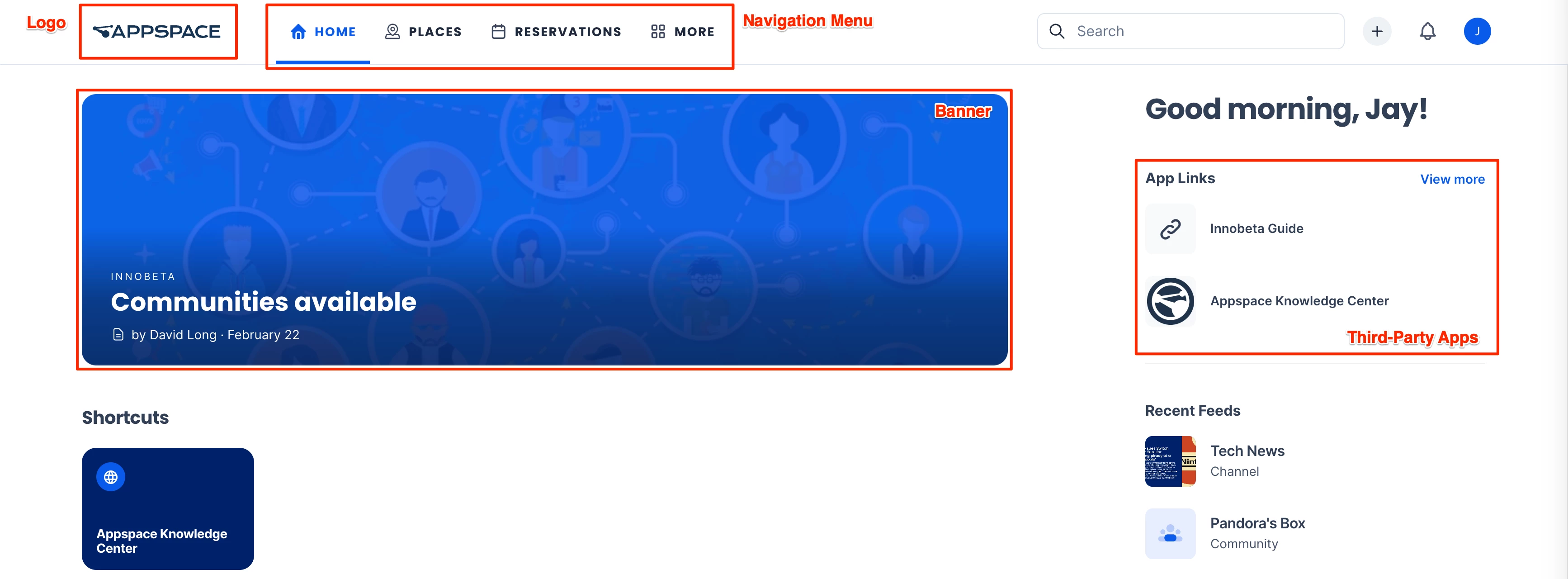
This article provides Administrators with instructions to configure various Employee Experience settings, including branding, theming, and 3rd-party application links utilized within the organization on the Employee Experience.
What's New
Features released in Appspace 8.8-ac.5 Lynx
- Improvement to the navigation bar in the Employee Experience allows dynamic adjustment of menu items based on available space and configured maximums in theme settings, with extra items grouped under More, which administrators can configure in the console under Settings > Configuration > Themes > Design.
Prerequisites
- An Account Owner or Location Admin user role with the Platform User license assigned.
- Themes Only – A Publisher (Location) user role with the Platform User license assigned.
Brand Settings for Employee Experience
The Brand settings listed below contain settings focused on customizing the organization’s branding for the Employee Experience.
The Brand settings can be accessed via the Settings > Configuration > Employee Experience > Brand tab within the Appspace console.
Configure Logo
The Logo setting option allows Admins to customize the logo on the Employee Experience to align seamlessly with your organization’s branding, ensuring a cohesive and professional appearance across all platforms.
To configure the Logo setting, upload or select an image from the Library:
- Logo – Recommended dimensions: 200 px x 80 px.
Configure Theme Colors
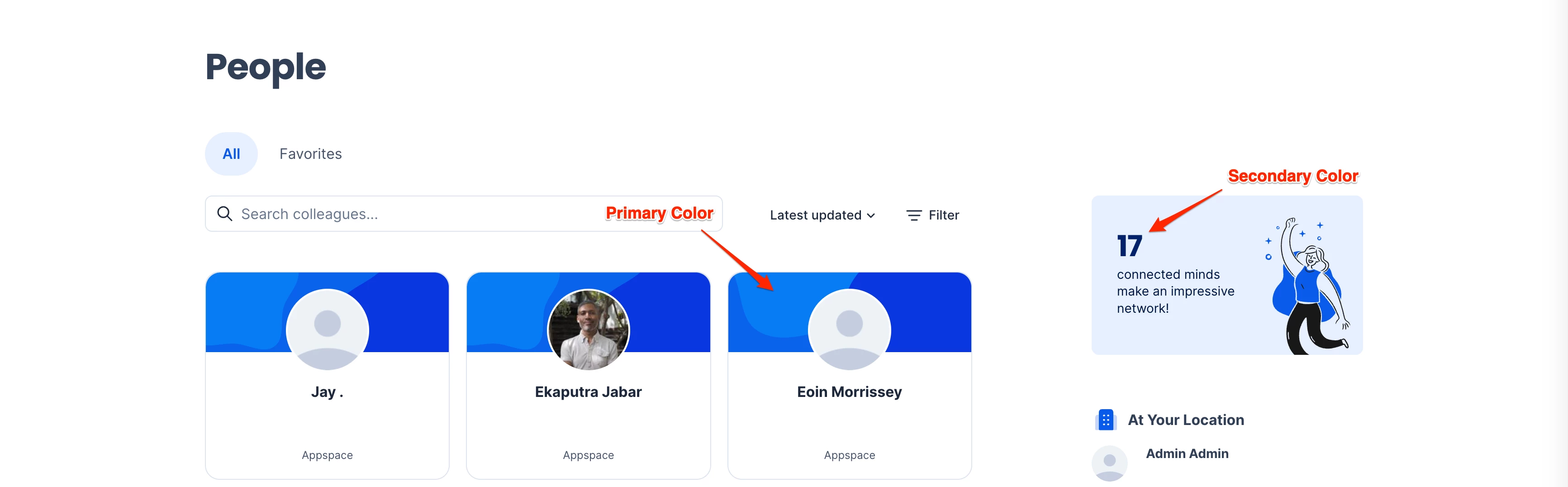
The Theme Colors setting option allows Admins to customize the primary and secondary theme colors on the Employee Experience to align seamlessly with your organization’s branding, ensuring a cohesive and professional appearance across all platforms.
To configure the Theme Colors setting, enter the Hex Color code or select a color from the color picker for the Primary and Secondary colors.
- Primary – The primary color will be used for primary selection such as buttons, hyperlinks, and more. It is recommended that this color has high saturation (60-100%).
- Secondary – The secondary color will be used for secondary elements such as placeholders and more. It is recommended that this color has low saturation (0-40%).
Configure Employee Experience Quick Post Device Template
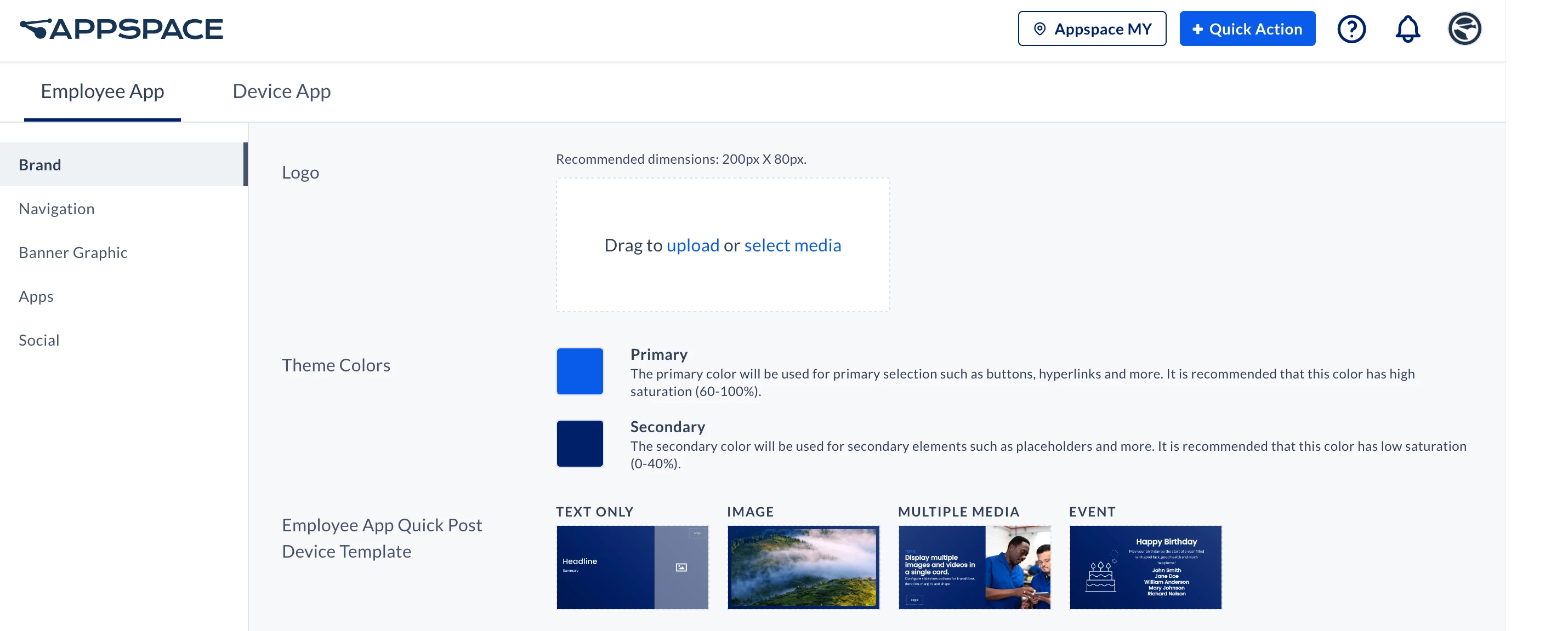
The Employee Experience Quick Post Device Template setting option allows Admins to customize the logo on the Employee Experience to align seamlessly with your organization’s branding, ensuring a cohesive and professional appearance across all platforms.
To configure the Employee Experience Quick Post Device Template setting, click the + icon and select the desired card to be assigned for the following Quick Post templates:
- Text Only
- Image
- Multiple Media
- Event
- Story
Configure Praises
(New) The Praises setting allows Admins to create custom praises on the Employee Experience to suit your organization’s style and branding. Praises are messages of appreciation or congratulations that can be sent to a colleague or group using the praise feature and posted to communities.
Follow the instructions below to view, create, and configure Praises:
- Log in to the Appspace console.
- Click the ☰ Appspace menu, and click Settings > Configuration.
- Click the Employee Experience tab, and click Global Brand from the side panel menu.
- In the Praises section below, click Manage Praises.
- The Praises view displays a set of praise templates. Here you may perform the following actions:
Note
You can have a maximum of nine active praises at a time.
- + Add – Click to create a new praise.
- Search – Enter a search term to display praises with the title.
- Activate/Deactivate – Click the toggle in the Active row to enable or disable the praise template on the Employee Experience.
- Sort – Click and drag the Sort (⋮⋮) icon up or down to rearrange the position of the praise.
- Edit / Reset to default – Click on the ellipsis (…) at the end of a praise and select Edit or Reset to default.
- Delete (only available for non-default praises) – Click on the ellipsis (...) at the end of a praise and select Delete.
- Move to Top (only available for items not already at the top) – Click on the ellipsis (...) at the end of a praise and select Move to Top.
- To edit a praise, click on the ellipsis (…) at the end of a praise and select Edit.
- Alternatively, you may click + Add to create a new praise and add it to the list.
- Configure the following fields. The right section of the window displays a preview of what the praise will look like.
- Icon – Click the update icon to browse and set an icon for the praise. This is required when creating a new praise.
- Title – Set the title of the praise. This field is required when creating a new praise.
- Language – Click the language icon to view and create translations for the praise. Select a language and type in the translated title of the praise.
- Illustration – Click the update icon to browse for a new illustration, or leave it as the default. This is required when creating a new praise. The image must be in SVG format and at a 1:1 or 3:4 aspect ratio.
- Update existing cards – Enable this option to replace all existing praises that use this template with the new design.
- Layout – Select to have the illustration fill up the side of the praise card or be displayed as a badge.
- Reset to default – This will undo all custom changes and revert the entire praise to its original form.
- Click Save to save the changes.
Navigation Settings for Employee Experience
The Navigation settings listed below contain settings focused on customizing the navigation menu on the Employee Experience.
The Navigation settings can be accessed via the Settings > Configuration > Employee Experience > Navigation tab within the Appspace console.
Configure Navigation Menu
The Navigation menu setting option allows Admins to manage and configure the sections (features) displayed on the Employee Experience navigational menu based on user permissions, or organization branding strategies.
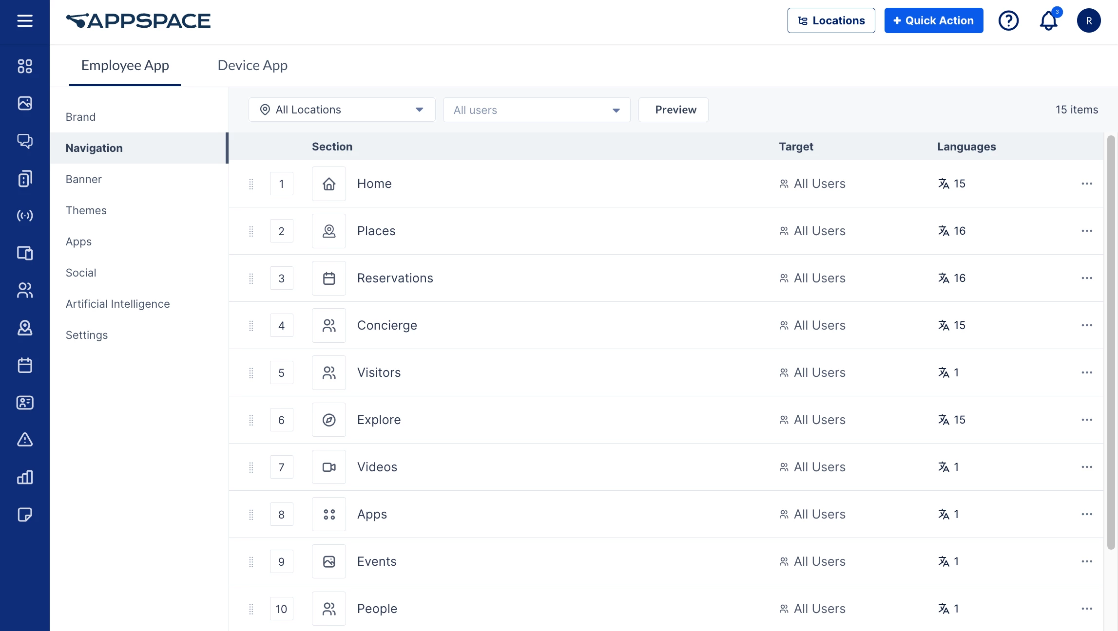
The layout for the Navigation tab organizes the sections in the same order as they would appear within the Employee Experience navigation menu, with each row listing the Section name, Target users, and Language translations available for each section. Here you may perform the following actions:
- Select Location – Display the sections based on the Location selected.
- Users – Select the user or user groups from the drop-down to display the sections based on the target audience selected.
- Preview – Click to preview the sections as displayed in the navigation menu on the Employee Experience.
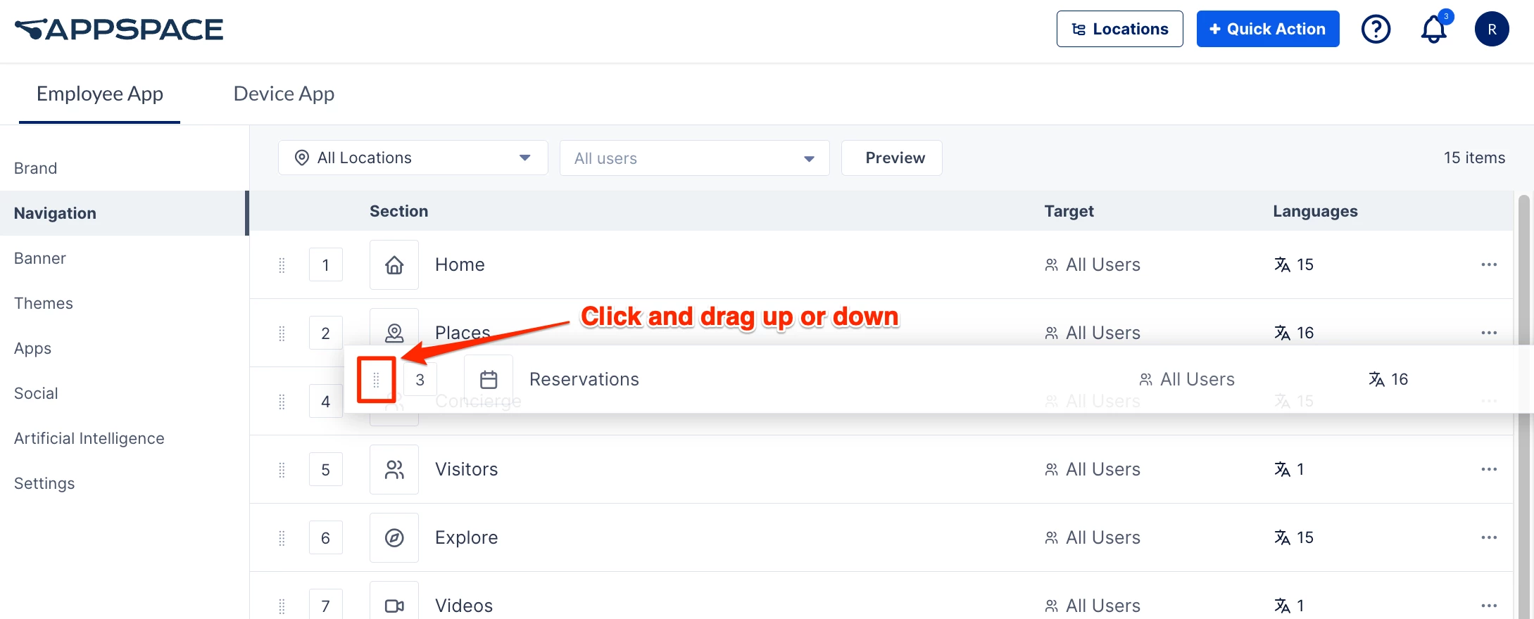
- Sort Sections – Click and drag the Sort (⋮⋮) icon up or down to move the sections based on your organization’s priority and branding strategies.
- Click the Ellipsis (…) at the end of a section to perform the following actions:
- Edit – Configure the section.
- Disable / Enable – Enable or disable the section from being accessed.
- Move to Top / Bottom – Sort the sections based on your organization’s priority and branding strategies.
To configure the Section within the navigation menu, click the ellipsis of the desired section menu item, and click Edit:
- Section – Displays the section name, or can be renamed to align with your organization’s branding.
- Language – Displays the language of the section, with the option to manually translate, or use AI to translate the selected language, or all languages available.
- Icon – Displays the icon of the section.
- Target – Displays the target audience of the section, with the option to select “Specific Users, Groups, or Locations” as the target audience of the section. Defaults “All Users” in Appspace.
- Add Users, Groups, or Locations – Assign the desired users, user groups, or locations as the target audience of the section.
- Status – Displays the status of the section, with the option to enable or disable the section from being accessed.
Add URL Navigation links to the Navigational Menu
(New) In addition to the default tabs in the Employee Experience navigation menu, the Navigation menu allows administrators to add custom menu items that link to internal or external URLs. These items can be tailored to reflect the organization’s specific branding and themes within the Employee Experience interface.
Follow the instructions below to add a URL link as a menu item to the navigational menu.
- Log in to the Appspace console.
- Click the ☰ Appspace menu, and click Settings > Configuration.
- Click the Employee Experience tab, and click Navigation from the side panel menu.
- Click the +Create button in the upper-right corner of the screen. Select URL and click Next.
- In the Create URL Navigation window, configure the following fields:
- Display text – Specify the title that will be displayed for the menu item.
- URL – Enter the URL that the menu item will open when clicked.
- Icon – Select an icon for the menu item.
- Audience – Select the audience that the menu item will be displayed to.
- Visible in – Select if the link will be visible to the Web, Web mobile, and or Native mobile (app) platforms. You may select more than one option or all options.
- Status – Set the menu item to be Enabled (visible) or Disabled.
- Click Save.
Add and Configure Mega Menu
(New) A Mega Menu is an expandable navigational menu with a larger panel that can display multiple columns with links, headings, media, and interactive elements in an HTML container. Administrators can create and configure Mega Menus in the Employee Experience navigational menu for an organization’s specific branding and themes.
Follow the instructions below to create and configure a Mega menu in the navigational menu.
- Log in to the Appspace console.
- Click the ☰ Appspace menu, and click Settings > Configuration.
- Click the Employee Experience tab, and click Navigation from the side panel menu.
- Click the +Create button in the upper-right corner of the screen. Select Mega Menu and click Next.
- The Create Mega Menu Navigation page is displayed. The main section displays a preview of the Mega menu as it is being created.
- In the General section, enter the following fields:
- Display text – Specify the title that will be displayed for the Mega Menu.
- URL – Enter the full URL for the landing page that users will be directed to when they click on the Mega Menu display text. The URL entered must be in complete format (e.g., https://www.yahoo.com). This field is optional.
- Icon – Select an icon for the Mega Menu.
- Audience – Select the audience that the Mega Menu will be displayed to.
- Visible in – Select if the Mega Menu will be visible to the Web, Web mobile, and or Native mobile (app) platforms. You may select more than one option or all options.
- Status – Set the Mega Menu to be Enabled (visible) or Disabled.
- Click Columns to expand the section.
- One column is enabled by default. Click + to create additional columns. You can add up to four columns.
- Select the column that you wish to edit. For each column, Click +Add and select one of the following:
- Link – Displays an internal or external link, similar to the URL Navigation Link in the section above.
- Icon Block – Displays a link as an icon, accompanied by a title and description.
- Featured Media – Displays an image link with a title. You can specify the size of the image (on a 1:1 ratio) for both web and mobile versions.
- HTML Container – Displays a specified URL or a web snippet as a preview block of the web content. You can specify the size of the preview block (on a 1:1 ratio) for both web and mobile versions.
- Header – Displays a text as a Heading in the column.
- Click Save.
Banner Settings for Employee Experience
The Banner settings listed below contain settings focused on customizing the Banner graphics on the Employee Experience.
The Banner settings can be accessed via the Settings > Configuration > Employee Experience > Banner within the Appspace console.
Configure Banner Content Type
The Select Content Type setting option allows Admins to determine the Banner Content displayed on the Employee Experience based on your organization’s branding strategies. The Banner’s recommended size is 300 px x 1170 px.
To configure the Select Content Type setting, select the desired content type from the drop-down menu:
- None – Disables the banner.
- Default – Displays the default “Welcome to the Employee Experience” product banner.
- Media – Displays media content as the banner, by selecting or uploading the content from the Library.
- Webpage – Displays web content as the banner, by entering the URL in the URL field.
- Last Content Posted – Displays the last content posted on the Employee Experience as the banner.
- Features Posts – Displays featured posts as the banner.
Theme Settings for Employee Experience
The Theme settings listed below contain settings focused on customizing the themes for the Employee Experience.
The Theme settings can be accessed via the Settings > Configuration > Employee Experience > Themes within the Appspace console.
Configure Employee Experience Themes
The Themes setting option allows Admins to customize the Employee Experience Home screen layout, tailoring the organization’s branding and user experience to specific locations (campuses or buildings) by adjusting key elements such as column layouts, widgets, logos, and footers.
Add Location-based Themes
Follow the instructions below to configure the Employee Experience theme for a new location.
Note
Themes assigned to a location will also be extended to sub-locations that are not individually themed.
- Log in to the Appspace console.
- Click the ☰ Appspace menu, and click Settings > Configuration.
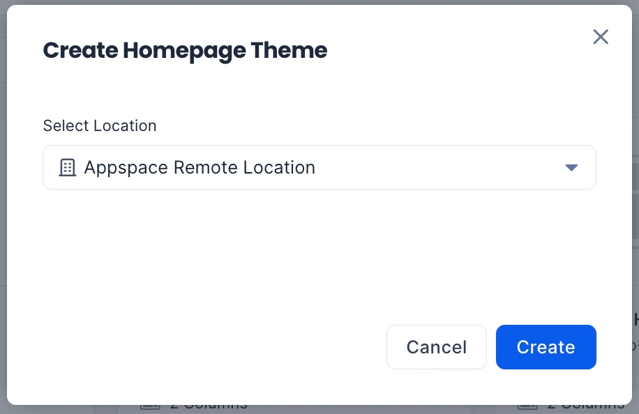
- Click the Employee Experience tab, and click Themes from the side panel menu. Click +Create.
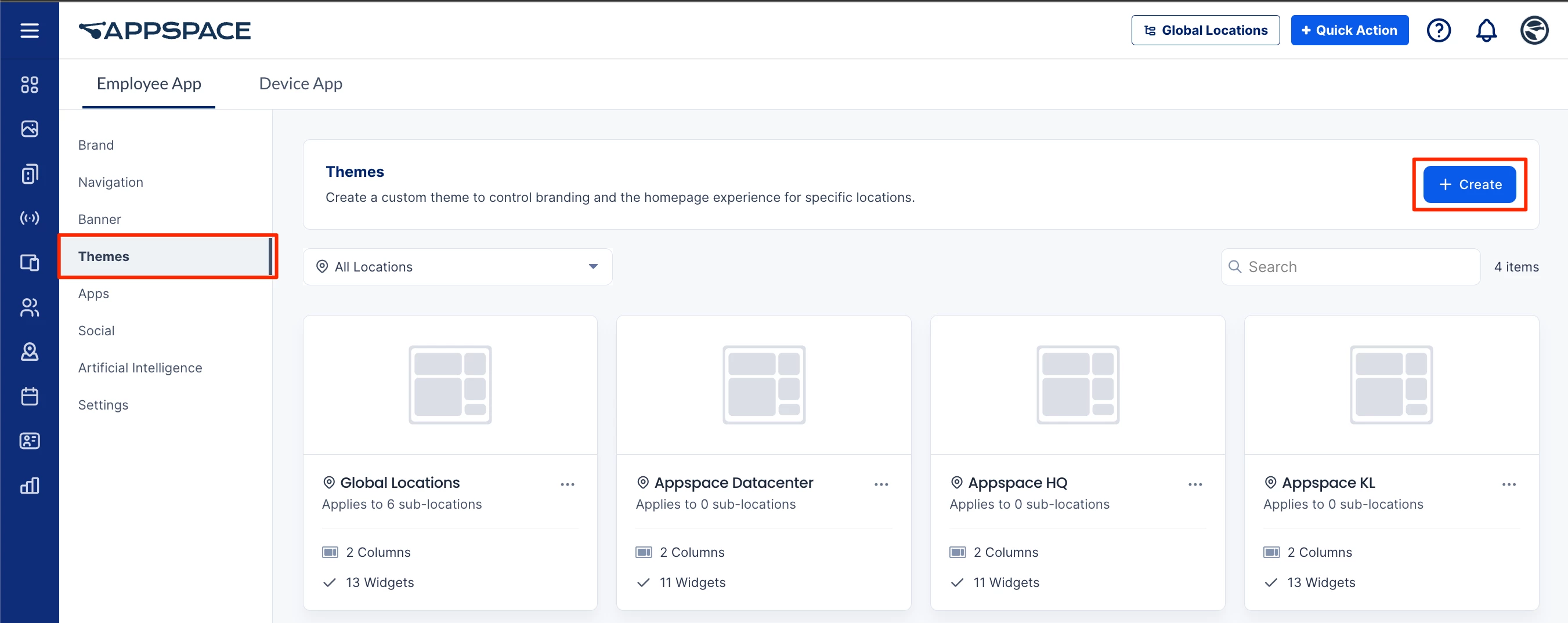
- Click the Select Location field. From the drop-down menu, select a location, expand a location to select a sub-location, or enter the location name in the Search locations field. Click Create.
- The theme of the Employee Experience for the location is created. You can preview the web, mobile, and tablet versions of your theme in the left section.
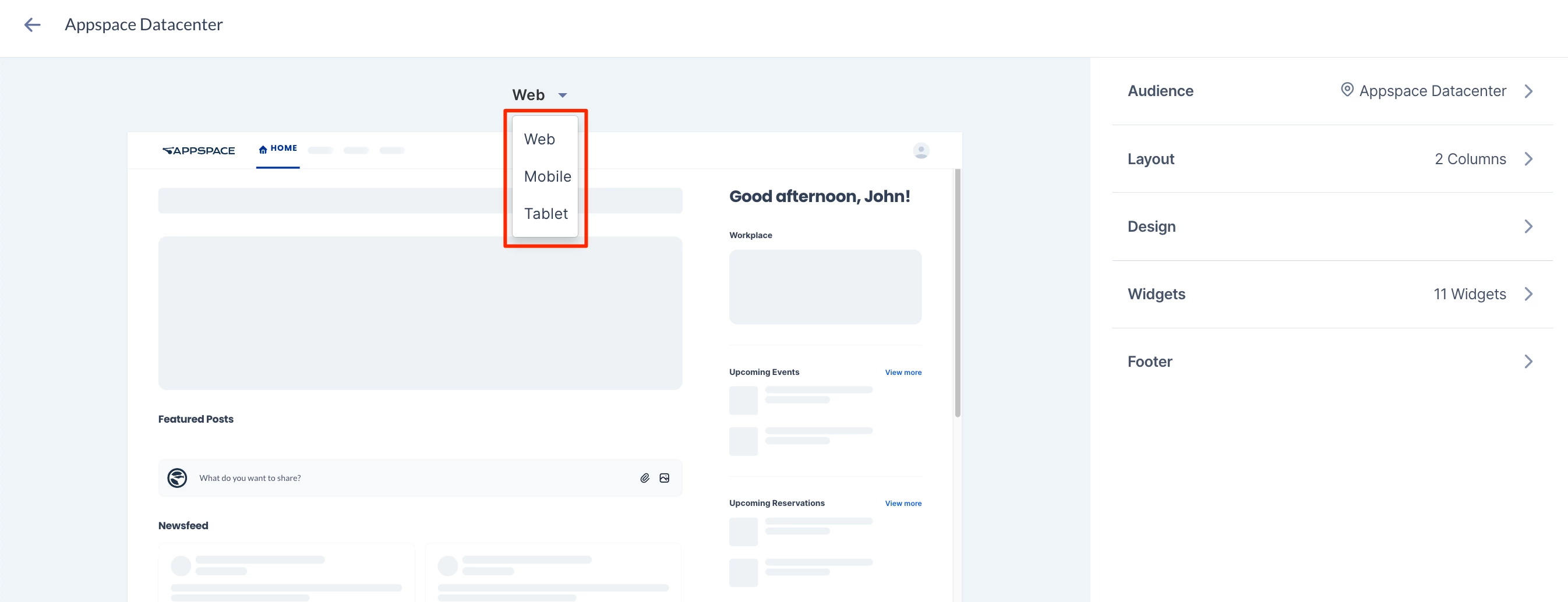
- The Audience section allows you to change the current theme’s location. Expand the section and click the Select location field to search or select another location or sublocation for the theme. You can select only locations that do not have a theme assigned.
- For Layout, expand this section to change the column layout and column names.
- Web Layout – This sets the number of columns displayed in the Employee Experience. You can select your layout to be 1, 2, or 3 columns.
Note
If you reduce the number of columns in the Employee Experience, you will be asked what to do with the widgets in the removed column:
- Move widgets – select a remaining column to move the widgets from the removed column.
- Delete widgets – delete the widgets from the removed column.
- Column name – Enter the name of each column in the Employee Experience, or leave the field empty to have the default name selected.
- Language – The language drop-down menu next to each Column name allows you to set the language translation for the Column name.
- Mark as Primary in Mobile – If there is more than one column, you may select a column as the first displayed in the Appspace App for Mobile. Select the ellipsis to set the column as the primary column in mobile.
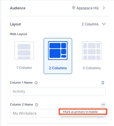
- Web Layout – This sets the number of columns displayed in the Employee Experience. You can select your layout to be 1, 2, or 3 columns.
- For Design, expand this section to customize the colors and logo displayed for the Employee Experience theme:
- (New) Primary Menu – Configure the maximum number of menus displayed on the navigation bar of the Employee Experience.
Note
By default, the number of menu items is set to 6 and can be increased to a maximum of 10; however, the display will adjust based on the screen size in the Employee Experience.
- Theme Colors – Select your desired primary and secondary colors for the theme. Click the Restore to default icon to restore the default colors.
- Web Logo – Drag and drop or click the icon to upload an image file for the logo on the Employee Experience. The recommended image resolution is 200px x 80px. Click the delete icon to remove an uploaded logo.
- Web Logo Size – Drag the slider to set the logo size on the Employee Experience.
- Mobile Logo – Drag and drop or click the icon to upload an image file for the logo on the Employee Experience for Mobile. Click the delete icon to remove an uploaded logo.
- Mobile Logo Size – Drag the slider to set the logo size on the Employee Experience for Mobile.
- (New) Primary Menu – Configure the maximum number of menus displayed on the navigation bar of the Employee Experience.
- For Widgets, expand this section to customize the widgets on each column in the Employee Experience theme.
Note
Each widget has different options, but the following options are common to all widgets.
- Column – Select the column for the widget to be in.
- Widget Title – Enable this option and enter the title to display it above the widget.
- Language – The language drop-down menu next to any field (such as Widget Title) allows you to set the language translation for the text. Refer to this article for more information.
- Mobile Layout – Set to Carousel to scroll items horizontally in the Employee Experience for Mobile, or List to list items vertically. Auto sets it to carousel by default.
- To reorder a widget, select a column, then click and drag the arrange icon at the left of the widget.
- To edit or delete a widget, select a column, then click the ellipsis (…) at the right of a widget.
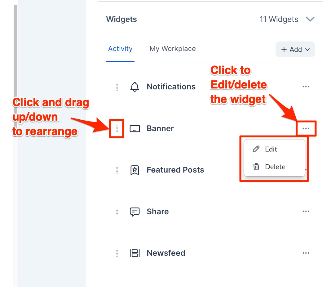
- To add a widget to a column, select the column, click +Add, and select one of the following widgets. You may add each type more than once.
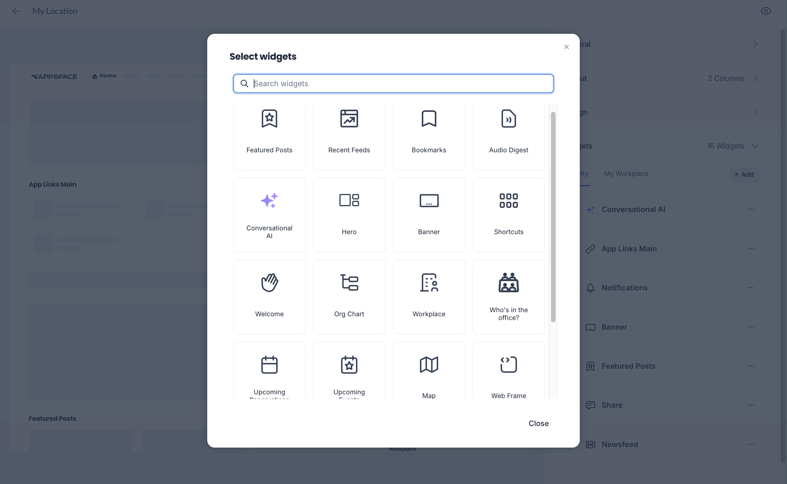
- Newsfeed – Displays the latest posts, stories, and pages published to you or your user group. You can customize the following options:
- Pagination – Set as Virtual Scrolling to continuously load posts as you scroll down the feed, or On Demand to show a limited number of posts with an option to show more.
- Membership Status – Include users who have joined and/or not joined the Communities.
- Subscription Status – Include users who are following and/or not following the Topics or Channels.
- Feeds – Select the feeds to be included. You can select more than one feed, or leave the field blank to select all feeds.
- Feed Types – Choose to include Communities, Topics, and Channels.
- Post Types – Choose to include User Posts, Questions, Polls, Praises, Events, Stories, and Pages as posts in the feed.
- Max Posts – Set the maximum number of posts displayed in the newsfeed.
- Featured Posts – Displays quick posts, event posts, stories, or pages that are set as featured and published in the Appspace Employee Experience. You can customize options similar to the Newsfeed widget above.
- Recent Feeds – Displays channels, topics, and communities that contain the latest posts. You can customize the following options:
- Mobile Layout – Set to Carousel to scroll feeds horizontally in the Employee Experience for Mobile, or List to list feeds vertically. Auto sets it to carousel by default.
- Feed Types – Choose to include Communities, Topics, and Channels.
- Max Feeds – Set the maximum number of feeds to be displayed.
- Bookmarks – Displays posts, stories, and pages that you have bookmarked.
- Audio Digest – Displays an audio playlist (including a skip to next feature) of articles read aloud by AI. You can select to play the latest articles, content from specific feeds, or from a list of curated posts.
- Source – Sets the source of the audio playlist:
- Recent posts – Plays the most recent articles.
- (New) Feeds – Specify the Feeds to play content from. For Max Posts, specify the maximum number of posts for the entire playlist.
- (New) Curated posts – Specify the Posts to play content from.
- Post Types – Choose to include User Posts, Events, Stories, and Pages in the audio playlist.
- Source – Sets the source of the audio playlist:
- (New) Conversational AI – Display an AI banner widget that lets users enter AI prompts or queries.
- Banner Color – Set the color of the banner.
- Background Image – Browse and select a background image for the banner.
- Web Height and Mobile Height – Set the height of the widget for web and mobile versions of the Employee experience.
- Actions – Enable the Find content and Find user options to display the Search Content and Search User prompt options in the widget.
- Hero – Displays a banner made out of several blocks (similar to the Hero banner) with the following options:
- Block – Select a block (Block 1, Block 2, etc.) or click + to add a new block.
- Content Type – Select one of the content types for the block. Each option will display sub-options for you to set.
- Media – Display media content on the block by selecting or uploading the content from the Library.
- Web Frame – Display web content on the block by entering a URL or a web snippet.
- Feeds – Enter a feed to be displayed on the block. You can customize options similar to the Newsfeed widget above.
- Features Posts – Displays the latest content posted as featured to the Employee Experience. You can customize options similar to the Newsfeed widget above.
- Block Title – Type in a title for the block, or leave blank for the default title (Block 1, Block 2, etc.)
- Icon – Select an icon to be displayed on the block.
- Banner – Displays a banner with one of the following options:
- Default – Follows the content type set in the Configure Banner section above on this page.
- Media – Drag and upload a media file to display as the banner. You can specify the height of the banner for web and mobile.
- Web page – Enter a URL to display the web page in the banner.
- Feed – Enter a feed to be displayed in the banner. You can customize options similar to the Newsfeed widget above.
- Featured Posts – Displays the latest content posted as featured to the Employee Experience. You can customize options similar to the Newsfeed widget above.
- Shortcuts – Displays a set of URL links. You can set the following options:
- Mobile Layout – Set to Carousel to scroll shortcuts horizontally in the Appspace Mobile App, or List to display the shortcuts in a grid layout. Auto sets it to carousel by default.
- External Link Target – This setting only applies to links on the Appspace Mobile App but may be overridden when the Disable In-App Browser setting is set to ON. Set to System Browser for the shortcuts to open in a new browser window or In-app Browser for the shortcut to open in the same window. Leave it as Default to follow the device setting.
- (New) Small column count – Select the amount of shortcuts that will be displayed per row in the grid layout. You can set for 1, 2, or 3 shortcut items to be displayed for each row in the widget. This only applies if the widget is not set as the main column on the web, and on the Appspace Mobile App if the widget is set to List for Mobile Layout.
- Shortcuts – Set the link text, URL, and icon in the widget. Click +Add link to create additional shortcuts.
- App Links – Displays links to third-party applications within the Employee Experience that apply to the employee’s needs. You can customize the following options:
- Mobile Layout – Set to Carousel to scroll links horizontally in the Appspace Mobile App, or List to list links vertically. Auto sets it to carousel by default.
- Max Links – Set the maximum number of links to be displayed.
- Welcome – Sets a welcome message to the current user. Leave it blank to have the default message (Salutation, FirstName). You may use identifiers such as {Salutation}, {FirstName}, and {LastName} together with fixed text.
- (New) Organizational Chart – Displays the organizational hierarchy of you, your manager, and any assigned secondary managers. For instructions on setting managers or secondary managers, see the Add Users, Send User Invitations, & Manage Users/User Groups article.
- Notifications – Displays broadcasts that are set as notifications.
- Share – Displays the quick post option, where you can quickly create posts, stories, and pages within the Appspace Employee Experience.
- (New) Workplace – Displays information about the building set as the employee’s location, such as temperature and colleagues in the office. Colleagues who have been set as favourites will be listed first. The widget will display the following options on the Employee Experience:
- Open building panel – This is displayed as a launch icon next to the building's name. Clicking this icon will open the building panel in the sidebar, similar to selecting a building under Places > Building Pass, displaying the option to Reserve a building pass or View available workspaces.
- Join Office – Click to directly book a building pass for the current building for the current day. This works similarly to the steps in Reserve A Building Pass – Employees, but it attempts to book the pass immediately without opening the sidebar. A notification will inform you if the pass is successfully created (or not), and the option will update to I’m in once confirmed.
- + Find Workspace – Click to open the Resource Finder in the sidebar to select a resource(s) and create a reservation.
- (New) Who’s in the Office – Lists the days of the current week with colleagues who will be within your current building location. Colleagues who have been set as favourites will be listed first. You can set the following options:
- Show only Favorites – Enable to set the widget to display only colleagues who have been set as favorites.
- Upcoming Reservations – Displays current and upcoming building passes and workspace reservations.
- Upcoming Events – Displays events and updates announced via posts on your Employee Experience.
- Map – Displays a map of the location of the theme (such as Location, Campus, or Building) if it is configured under Locations. You can specify the height of the map for web and mobile. This widget will be hidden if there is no map configured.
- Web Frame – Displays an external website or web snippet in a container frame. You can specify the URL or web snippet to display in the widget and the height of the web frame for web and mobile.
- (New) Custom Widgets – This feature allows you to add custom widgets. To get started, navigate to Appspace Console > Settings > Widgets and create your custom widget and import your custom widget files in ZIP format. Once created, your custom widgets will be listed here and available for use.
- Newsfeed – Displays the latest posts, stories, and pages published to you or your user group. You can customize the following options:
- Expand the Footer section to create and customize the footer of the Employee Experience. You can use this to display information at the bottom of the page, such as additional links or copyright notices.
- Click +Create to create a footer.
- Text and Background Color – Select the color for the footer text and background.
- Hide in Mobile – Sets the option to not display the footer in the Appspace Mobile App.
- Columns – Click + to add up to four text columns to the footer. For each column, enter and format the text in the text editor. Click the ellipsis next to each column to delete or move the position of the column.
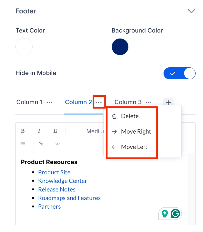
- At the upper-right corner, click Save to save your changes.
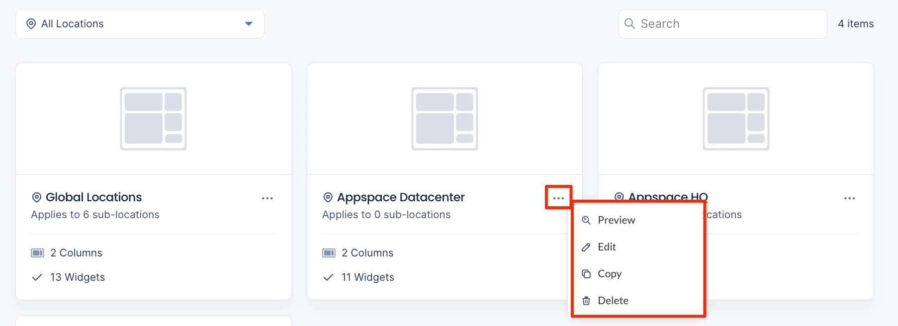
Search and Edit Location-based Themes
Follow the instructions below to edit location-based themes:
- Log in to the Appspace console.
- Click the ☰ Appspace menu, and click Settings > Configuration.
- Click the Employee Experience tab, and click Themes from the side panel menu.
- Click the Locations field. Select a location or sub-location from the drop-down menu or enter the location name in the Search locations field.
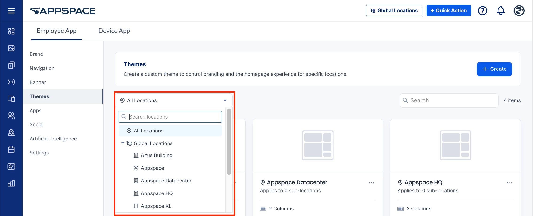
- Click the ellipsis (…) icon at a location, building, or campus. You can perform the following:
- Click Preview to view the Employee Experience theme.
- Click Edit to configure the theme, or Delete to remove the theme for the location.
- Click Copy and select a new location from the drop-down list to copy the theme to the location.