


The Global Brand settings provide administrators with a centralized space to define the organization’s visual identity across all platforms in the Employee Experience. The Global Brand settings can be accessed via the Settings > Configuration > Global Brand within the Appspace console. These configurations help maintain a cohesive, polished, and scalable interface, reflecting the organization’s branding across devices, themes, and UI components.
Note:
The following cards currently inherit Global Branding configurations to ensure a unified experience across the platform:
-
Announcement Card
-
AI Generated Card
-
Room Booking Card
-
Schedule Board Card
Important:
-
A total of 4 cards currently inherit Global Branding configurations.
-
The Desk Booking Card theme does not inherit global branding.
-
Global brand inheritance applies to newly created cards only; existing cards are unaffected.
-
Announcement Card Specific Detail: Global brand inheritance covers all 13 available themes of the Announcement Card.
Field Mappings and Card Details
This table explicitly shows how Global Brand settings map to the fields in the inheriting cards (Announcement Card, AI Generate Card, Room Booking Card, and Schedule Board Card).
| Card Field Mapping | Announcement Card | AI Generate Card | Room Booking Card | Schedule Board Card |
|---|---|---|---|---|
| Background | Yes | Yes | Yes | Header Background Color or Image |
| Accent | No | No | No | No |
| Text | Headline Summary | Headline Summary | No | Header Title Table Text Color |
| Fonts - Header | Headline | Topic Headline | No | No |
| Fonts - Body | Summary | Summary | No | No |
This article outlines the configuration steps for global brand settings.
Prerequisite
- The Global Brand settings page is accessible only to the Account Owner.
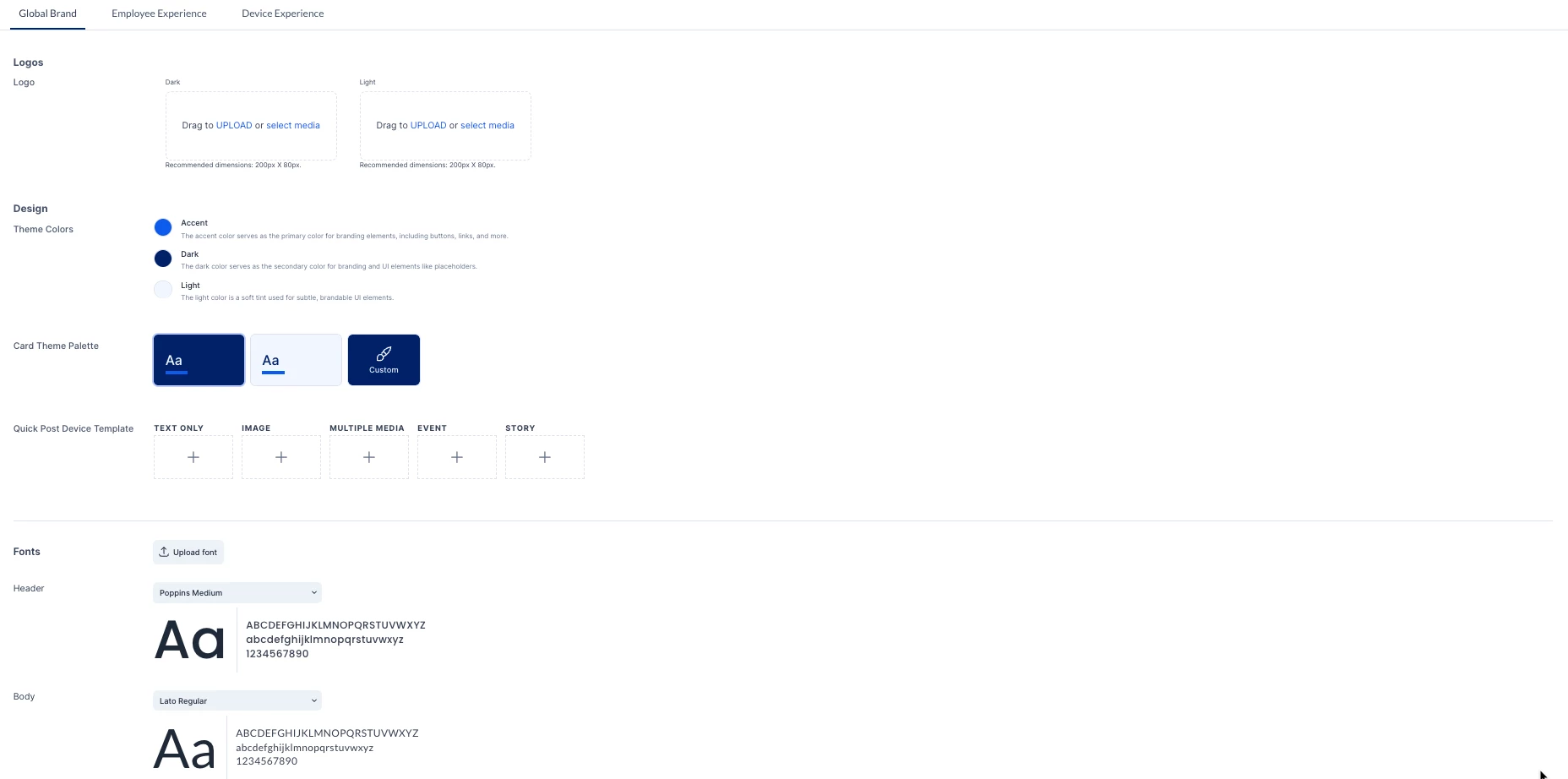
Configure Logos
The Logos section allows administrators to upload and manage the brand’s primary logo assets, ensuring consistent appearance across light and dark interface themes.
-
Log in to the Appspace console.
-
Click the ☰ Appspace menu.
-
Select Settings > Configuration.
-
Click the Global Brand tab.
-
In the Logo section, perform the following actions:
-
Identify Logo Variants: The section displays two distinct upload areas for theme compatibility:
-
Dark Logo: Recommended for display on light backgrounds.
-
Light Logo: Recommended for display on dark backgrounds.
-
-
Upload Logo Assets: Add the logo file using: Drag-and-drop, Upload from local computer, or Select Media from Library.
Note:
- Recommended Dimensions: 200px x 80px (Ensures clear, consistent rendering across platforms.)
-
Supported File Formats: SVG and PNG.
-
Ability to Delete Logos: Logos can be deleted using the trash bin icon (or delete option).
- Once done, click Save.
Configure Design Settings
The Design section enables administrators to define the core visual elements of the interface, including color themes and card aesthetics, to ensure the overall experience reflects the organization’s brand identity.
Note:
The “Design” section is divided into two dedicated subsections: “Theme Colors” and “Card Theme Palette.”
-
Log in to the Appspace console.
-
Click the ☰ Appspace menu.
-
Select Settings > Configuration.
-
Click the Global Brand tab.
-
In the Design section, perform the following actions:
-
Configure Theme Colors: Define the three primary color modes:
-
Accent: Select the main brand color for high-visibility elements (buttons, links, icons).
-
Dark: Select a secondary color used for structural or supporting UI components.
-
Light: Select a subtle tint used for minimal or gentle visual elements.
-
-
Configure Card Theme Palette: Define the default appearance of content cards by selecting one of the available options:
-
Dark Theme
-
Light Theme
-
Custom Theme
-
-
If Custom Theme is selected, define the following elements:
-
Background Color: Set the default background color used for card templates.
-
Text Color: Set the default text color used for card templates.
-
Accent: Define the accent background color used for card templates.
-
Card Logo: Add the logo file using: Drag-and-drop, Upload from local computer, or Select Media from Library.
Note:
Recommended Dimensions: 200px x 80px (Ensures clear, consistent rendering across platforms.)
When a content creator selects the Custom Theme Palette to create a new card:
- If a custom Card Logo is uploaded in the Global Brand Center, the new card will display that logo by default.
- If NO custom Card Logo has been uploaded for example, the field is empty, the new card's logo field will be empty by default (no fallback logo will be applied).
-
-
-
Once done, Click Save.
Configure Quick Post Device Templates
The Quick Post Device Templates section empowers administrators to set predefined templates for various content types, supporting faster, more consistent content creation across devices.
-
Log in to the Appspace console.
-
Click the ☰ Appspace menu.
-
Select Settings > Configuration.
-
Click the Global Brand tab.
-
In the Quick Post Device Templates section, define or modify templates by clicking the “+” icon displayed on the corresponding template tile for the following types:
- Text Only
- Image
- Multiple Media
- Event
- Story
- Once done, click Save.
Configure Fonts
The Fonts section defines the typography used across the Employee Experience. Administrators can customize the brand’s visual voice via header and body font settings.
-
Log in to the Appspace console.
-
Click the ☰ Appspace menu.
-
Select Settings > Configuration.
-
Click the Global Brand tab.
-
In the Fonts section, perform the following actions:
-
Upload Custom Fonts (Optional): Click the Upload Font button and upload the custom font file.
-
Configure Default Fonts: Select the typography for the two main text hierarchies:
-
Header Font: Choose a font used for titles, headings, and high-level emphasis.
-
Body Font: Choose a font applied to standard content for optimal readability.
Note:
Font Workflow and DeletionUnified Upload Workflow: The user only needs to upload the font once, and it will become available for both the Header and Body font selectors.
Deletion: Using the trash bin icon (or delete option) to remove a custom font will delete it for both the Header and the Body selectors.
-
-
-
Once done, click Save.