


The Content Index widget gives employees a structured way to discover and open Pages and Stories published across Appspace. It can be added to an Employee Experience Home theme or to the Feed or Sidebar of a Community or Topic.
The widget displays only content that the signed-in employee has permission to view. Selecting an item opens the corresponding Page or Story.
Prerequisites
Before configuring the Content Index widget, ensure that:
- Your Appspace Cloud deployment is version 2603.0 or later.
- You have permission to edit the applicable Employee Experience theme, Community, or Topic.
- The Pages or Stories you want to display have been published to the appropriate Spaces.
Add the Content Index widget to a Home theme
- Log in to the Appspace Console.
- Go to Settings > Configuration > Employee Experience > Themes.
- Create a theme or edit an existing theme.
- Expand Widgets.
- Select the column where you want the widget to appear.
- Click + Add and select Content Index.
- Configure the widget using the settings described below.
- Click Apply.
- Click Save to publish the theme changes.
The Content Index widget supports one, two, and three-column Home layouts. More than one Content Index widget can be added to the same Home theme. Each instance retains its own title, sources, organization, and display settings.
Add the Content Index widget to a Community, Channel, or Topic
- Open the Community or Topic in the Employee Experience.
- Click Settings in the left pane.
- Select Widgets.
- Select Feed or Sidebar.
- Click + Add Widget.
- Select Content Index.
- Configure the widget using the settings described below.
- Click Apply.
- Click Save.
Note
Multiple Content Index widgets can be added to the same Community or Topic. Each widget operates independently and can use different content sources and display settings.
Configure the widget
Configure the following fields as required.
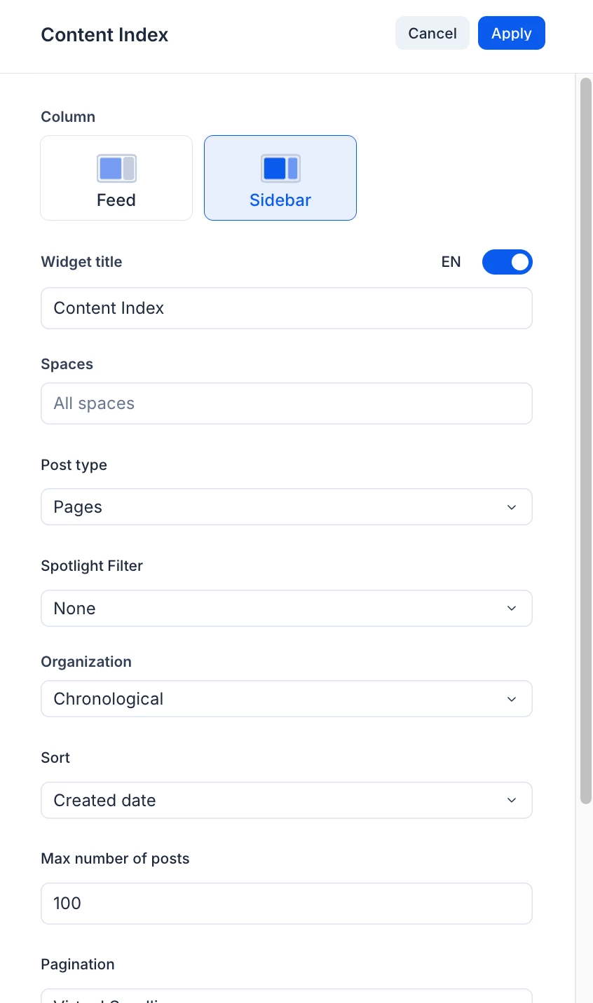
Column
Select wether the widget appears in the main feed or sidebar.
Widget Title
Enter the title displayed above the widget. Use the language selector to provide translated versions of the title where required.
Spaces
Select the Spaces from which the widget retrieves content.
- Leave the selection empty to include all available Spaces.
- Select one Space to restrict the widget to that Space.
- Select multiple Spaces to combine content from those Spaces.
Note
If a selected Topic or Community is later deleted, the deleted source is removed from the widget configuration. If no valid selected sources remain, the widget returns to All Spaces.
Post Type
Select the Page or Story content type available for the current widget context. The options shown may depend on the selected source and organization.
Organization
Select how content is organized in the widget:
- Alphabetical – Arranges content alphabetically by title.
- Chronological – Arranges content using its creation or modification date.
- Popularity – Arranges content according to popularity.
- Tags – Organizes content under selected content tags.
- Site Map – Displays the Page hierarchy of a selected Topic.
Alphabetical organization
When Alphabetical is selected, enable Show A–Z Index Filter to display letter shortcuts above the content.
Employees can select a letter to jump to the corresponding group of titles. The # shortcut represents titles that begin with a number or special character.
The index remains within the boundaries of the column containing the widget. If multiple Content Index widgets appear on the same page, each widget’s index controls only that widget.
Chronological organization
When Chronological is selected:
- Select whether content is arranged using its creation date or modification date.
- Set the maximum number of posts to retrieve at a time.
- Select the required pagination method.
Popularity organization
When Popularity is selected:
- Set the maximum number of posts to retrieve at a time.
- Select the required pagination method.
Tags organization
When Tags is selected, choose the tags used to group content.
Select Customize Tags to configure the label and description associated with a tag. A tag description can contain up to 200 characters. The character counter updates as text is entered and prevents additional text after the limit is reached.
Select an Item Display option:
- List – Displays tags and their matching content in a grouped list.
- Card – Displays a responsive grid of tag cards. Each card includes the tag icon, label, and description. In Card display, Thumbnail and Caption are enabled by default.
Tag and Site Map groups are collapsed when the page first loads. Employees can expand a group to view its contents.
Selecting a tag card or tag list item opens a dedicated Tag Page. The Tag Page:
- Displays content matching the selected tag.
- Applies the Spaces, post type, sorting, and maximum-post settings configured in the originating widget.
- Displays the configured tags in a sidebar and highlights the active tag.
- Allows the employee to select another tag without returning to the original page.
- Provides a breadcrumb for returning to the page containing the widget.
- Displays the widget title in the navigation bar when a title has been configured; otherwise, it displays the tag name.
- Displays an empty state when no content matches the selected tag.
- Displays Load more when additional results are available.
The widget configuration does not display a Pagination setting for Tags organization. Additional results on the Tag Page are retrieved using Load more.
Site Map organization
Site Map is available when the widget uses a single Topic source. If the current source or content type does not support Site Map, the option is displayed as unavailable and identifies Site Map as a Topic-specific option.
When Site Map is selected:
- Select the Topic to use as the source.
- Select the Site Map Root Page. The Topic root and its available Page levels can be selected.
- Set the Maximum Depth to control how many hierarchy levels are displayed.
- Save the widget.
The Site Map initially displays its branches in a collapsed state. Employees can expand and collapse the hierarchy and select an entry to open the corresponding Topic or Page.
Entries remain selectable when Maximum Depth is set to one.
The widget configuration does not display a Pagination setting for Site Map organization.
Pagination
For Alphabetical, Chronological, and Popularity organization, select one of the following pagination methods:
- Virtual scrolling – Retrieves more content automatically as the employee scrolls.
- On demand – Displays a control that the employee can select to retrieve more content.
For Chronological and Popularity organization, the value entered in Maximum Number of Posts determines the number of items retrieved in each batch.
Alphabetical organization retrieves content in its standard alphabetical batches. A Maximum Number of Posts value previously configured for another organization does not alter the alphabetical batch size.
Pagination is not available in the widget configuration for Tags or Site Map organization.
Display options
Use Display Options to control the metadata shown with each content item. Depending on the selected organization and item display, the available options include:
- Thumbnail
- Caption
- Author
- Date
- Space
- Tags
- Spotlight badge - a badge indicating that the page or story is a spotlight item.
Select an option to display it or clear it to hide it. Changes take effect after the widget is applied and the page is saved.
Notes
- Employees see only page and story content they are allowed to access.
- Content scheduled for a future publication date does not appear in the widget before that date. After the content is published and becomes available to the employee, it can appear according to the widget’s configured source, post type, organization, and filters.
- When a Page or Story has an uploaded or AI-generated image, the widget uses that image as the thumbnail. If the content does not have an image, the widget displays a default thumbnail that identifies the content type.
- When all supported metadata is displayed, tags remain visible with the content item. If an item contains more tags than can be displayed, move the pointer over the additional-tag indicator to view a tooltip of the remaining tags.
- Where sufficient horizontal space is available, the search field is displayed on the same line as the widget title. Content Index search is available when the widget has sufficient horizontal space but is omitted from narrow Sidebar and mobile layouts.
- Tags and Sitemap hierarchies are collapsed by default and can be expanded by the employee.