
Unlock Real-Time Workplace Intelligence: Your Guide to the New Insights Dashboards
The Insights module has replaced the previous Analytics module in Appspace. With a redesigned experience built around dedicated dashboards, the Insights module is a significant leap forward in enabling administrators to measure and track key data across the platform.
If you've been using Analytics to track trends across your platform, your data is still available. It has been reorganized into focused system dashboards, each covering a specific area of the platform.
Along with the new system dashboards, the Insights module introduces the ability to build custom dashboards and surface them directly in the Intranet.
This guide walks you through what's changed, how the new system dashboards are organized, and how to build your first custom dashboard using a real-world scenario.
Key Benefits
- Dedicated System Dashboards: Focus your analytics for each platform area (Intranet, Digital Signage, Library Content, Campaigns, and more) with relevant metrics grouped together.
- Custom Dashboards: Build your own dashboards from scratch, combining widgets from any category to match your specific workflow or reporting needs.
- Intranet Visibility: Surface dashboards directly in the Intranet so team members and employees can view data without needing a platform license or access to the Console.
What This Guide Covers
- What's changed from the previous Analytics experience and how the new system dashboards are organized
- How custom dashboards work and what you can do with them
- Building a custom dashboard using a practical intranet use case
- Surfacing dashboards in the Intranet for broader visibility
Prerequisites
- Platform License: Required to access the Insights module in the Console
- Account Owner or Location Admin role: Required to create, edit, and manage dashboards
Understanding the New Dashboard Experience
If you previously used Analytics, the most important thing to know is that the Analytics module has been replaced by Insights in the left-hand navigation. Your data is still available, but it has been reorganized into dedicated system dashboards rather than the section-based layout you may be used to.
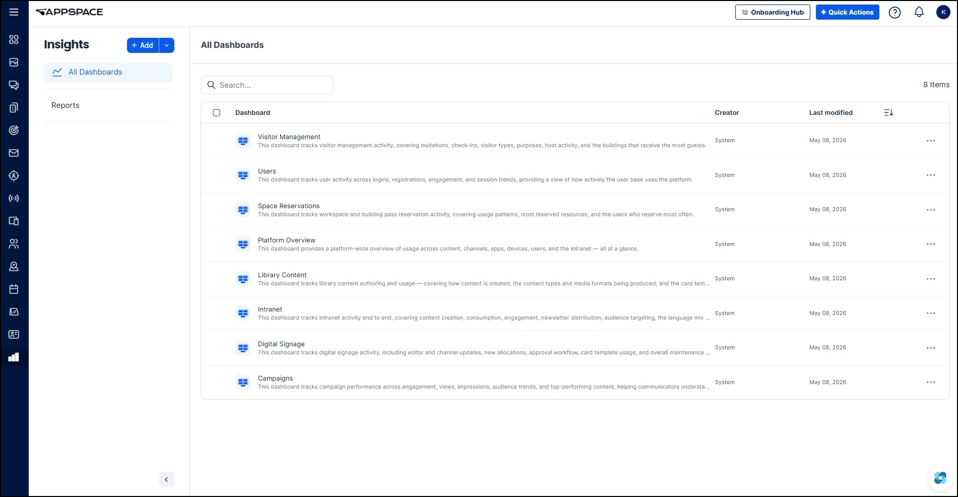
When you navigate to Insights, you'll see the All Dashboards view. This is the central hub for all reporting and analysis. The previous Analytics module combined several areas into a single interface. The new Insights experience breaks these out into dedicated system dashboards, each focused on a specific area of the platform:
- Visitor Management: Visitor check-ins, invitations, visitor types, host activity, and building traffic
- Users: User logins, registrations, engagement, and session trends
- Space Reservations: Workspace and building pass reservation activity, usage patterns, and top reserved resources
- Platform Overview: Account-wide summaries of signage content, channels, apps, and devices (previously the Apps Analytics section and the summary widgets in the old Analytics Dashboard)
- Library Content: Content authoring and production metrics, including active authors, content added by period, and template usage (previously Content Analytics)
- Intranet: Intranet activity stats, post view trends, impressions, content by type, and top spaces
- Digital Signage: Channel updates, allocations, editor activity, approval workflows, and template usage (previously Channel Analytics)
- Campaigns: Campaign engagement, view and impression trends, top content, referral sources, and audience trends across all campaigns
The underlying data is the same. It's the organization that has changed. You may find familiar metrics in new locations as each dashboard groups its data by platform area rather than by the old Analytics section layout.
Custom Dashboards
Beyond the system dashboards, the Insights module now lets you build your own dashboards from scratch. This is a net-new capability. Previously, Analytics only offered the pre-built system views with no way to create your own or customize the data they displayed.
Custom dashboards let you curate a focused set of widgets around a specific topic, workflow, or team need. Rather than navigating through multiple system dashboards to find the data you care about, you can pull everything into one view. For example, a communications team might build a dashboard that combines intranet post performance with campaign engagement metrics, data that lives in two separate system dashboards but makes more sense when reviewed together.
The widget template chooser offers templates organized by category (AI, Campaigns, Devices, Posts, Reservations, Spaces, Usage, Visitors), and you can combine widgets from any of these categories into a single dashboard. You can also surface custom dashboards directly in the Intranet, giving visibility to people who may not have access to the Console.
You can edit, rename, or delete your custom dashboards at any time by opening the dashboard and using the ellipsis (...) menu in the top-right corner. Any custom dashboard you create is visible to all users who have access to the Insights module in the Console.
You can also export a custom dashboard as a JSON file, which can then be imported into another Appspace environment. This is useful for sharing a dashboard configuration across accounts or providing a starting point for other teams.
Building Your First Custom Dashboard: Intranet Use Case
Let's put custom dashboards into practice. You're a workplace communications administrator and you want a focused dashboard that answers one question: How is our intranet content performing this week, and where should we focus our effort?
The system Intranet dashboard covers broad activity trends. Here, we'll build a custom dashboard that zeros in on actionable engagement metrics.
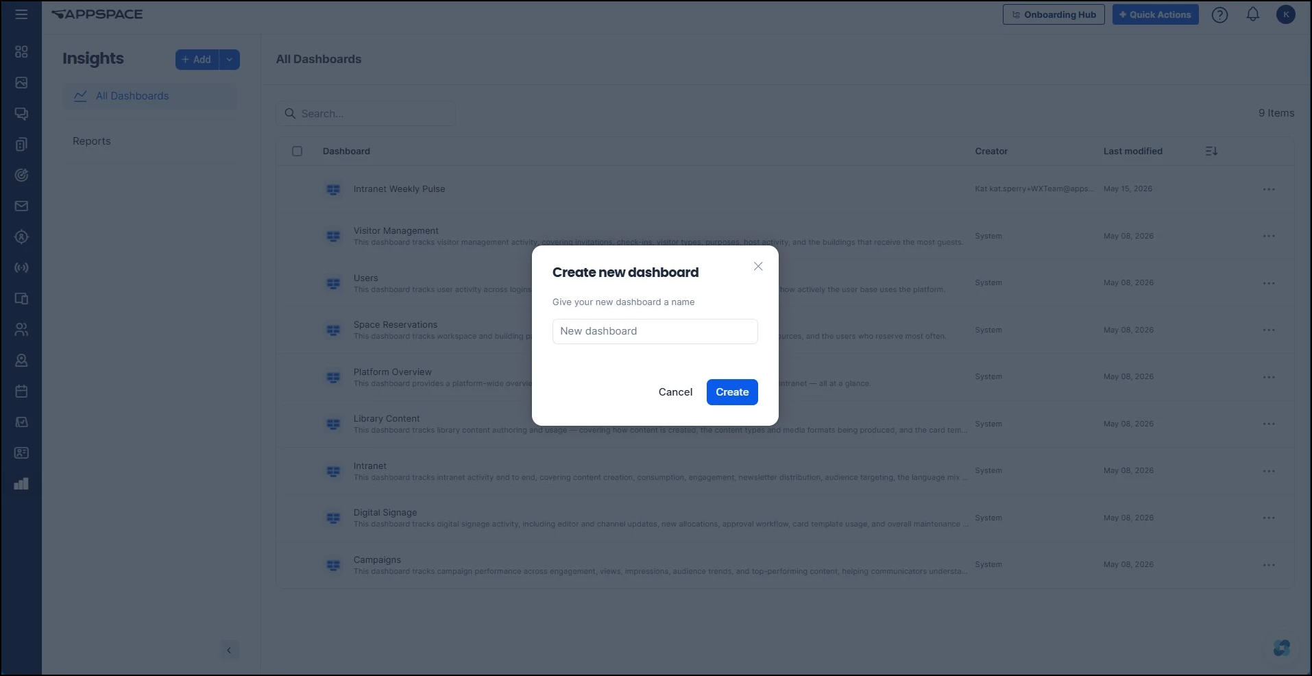
Step One: Create a New Dashboard
Navigate to Insights and click the + Add button. Give your dashboard a descriptive name. For this scenario, something like "Intranet Weekly Pulse."
Step Two: Add Your Widgets
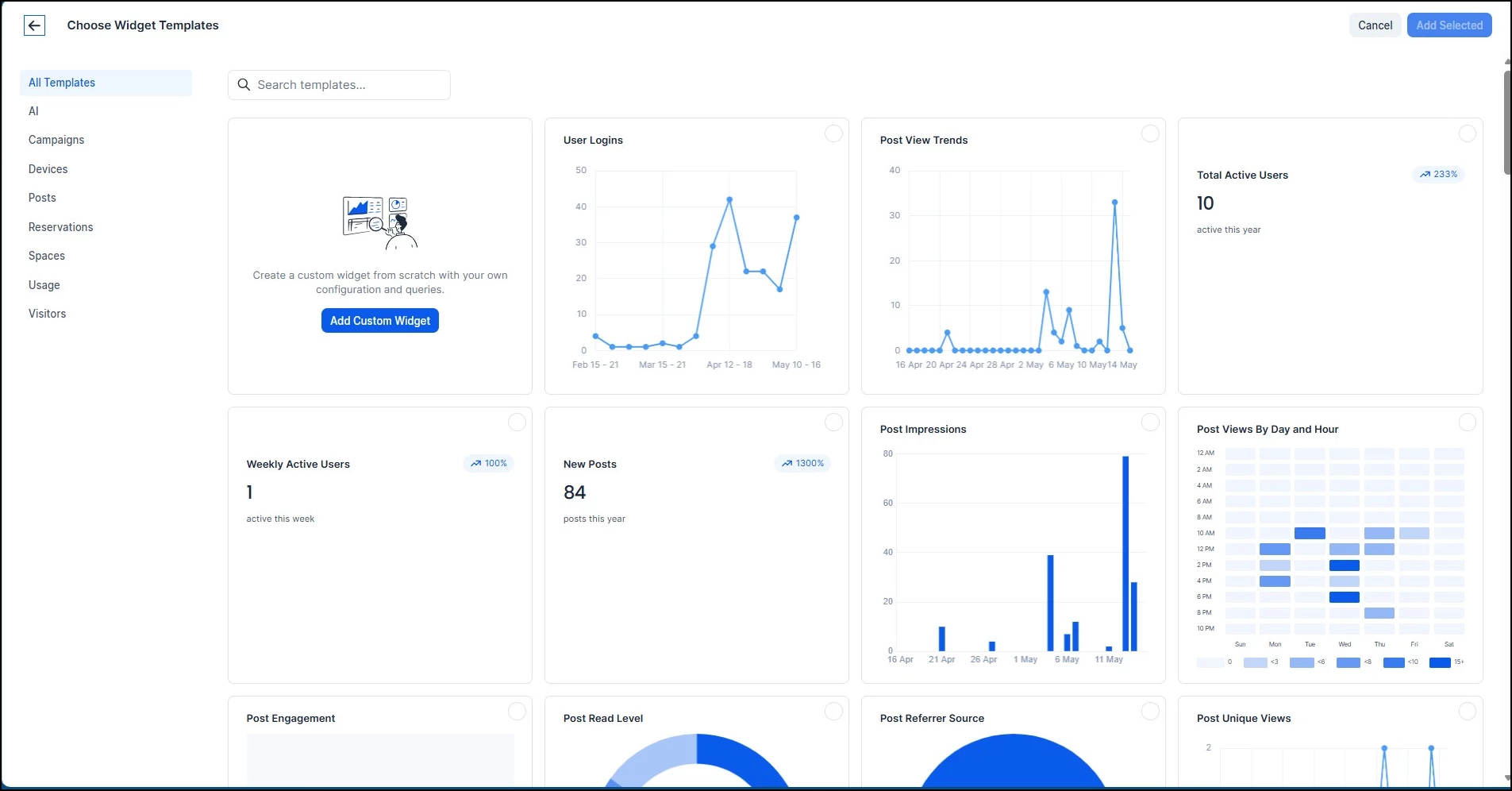
Once your dashboard is created, you'll add widgets to populate it with data. Click Add Widget to open the widget template chooser.
You'll notice the template chooser includes category filters on the left (AI, Campaigns, Devices, Posts, Reservations, Spaces, Usage, Visitors). Many of these templates surface the same data you may already be familiar with from the system dashboards. The difference is that now you choose which widgets to include and how to arrange them.
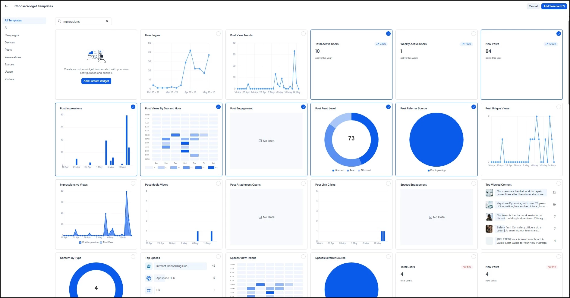
For our intranet engagement dashboard, here are the widgets to consider and why:
Start with these core widgets:
- Total Active Users: Your baseline. This tells you how many people are actually visiting the intranet this period. If this number is low, it doesn't matter how good your content is, people aren't seeing it.
- Post Views By Day and Hour: This is your publishing strategy widget. It reveals when your audience is most active, so you can time your posts for maximum visibility. Look for the darkest blocks in the heatmap, those are your peak engagement windows.
- New Posts: Track your team's output. Compare this against engagement metrics to understand whether more content is translating to more engagement, or whether you're hitting diminishing returns.
Add these for deeper analysis:
- Post Impressions: Shows how many times posts appeared in feeds, regardless of whether they were clicked. A high impression count with low engagement signals a headline or thumbnail problem, not a distribution problem.
- Post Engagement: The action metric. This captures clicks, reactions, and interactions beyond passive views. Compare this to impressions to get your effective engagement rate.
- Post Read Level: Tells you whether people are skimming or actually reading your content. If read levels are consistently low, your content may be too long or not relevant enough to the audience.
- Post Referrer Source: Where is your traffic coming from? This helps you understand whether people find your intranet through direct navigation, search, email links, or the Intranet, which informs where you should promote content.
Consider adding a Custom Widget for:
- A combined view that brings together multiple data points into a single visualization. For example, you could build a widget that shows currently trending posts alongside weekly engagement trends in one place, rather than switching between separate widgets.
Step Three: Customize and Configure
Once your widgets are added, you can customize each one and arrange them into a layout that works for your workflow.
Customizing Widgets
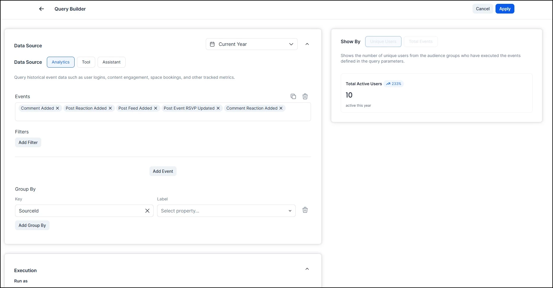
Every widget can be fully customized. Click the ellipsis next to any widget and select Build Query, where you can configure:
- Data Source: Choose between Analytics (historical event data), Tool (real-time API data), or Assistant (AI-powered natural language queries)
- Events and Filters: Select which events to track and add filters to narrow the data
- Group By: Group results by a specific dimension for more granular breakdowns
- Results: Set a result limit and sort order (ascending or descending)
- Execution: Choose whether the widget runs as the Viewer (the person looking at the dashboard) or the Owner (the person who created it)
- Cache: Set a cache duration (up to 30 days) and auto-refresh interval to control how often the data updates
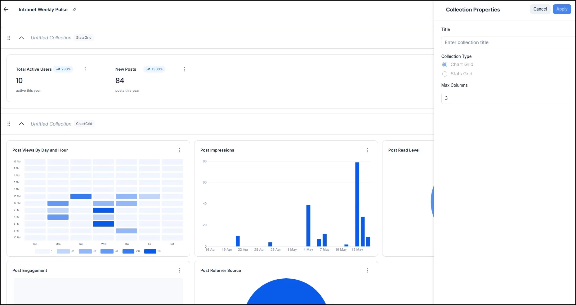
Grouping Widgets into Collections
You can also organize related widgets into collections, which group them together visually on the dashboard. There are two collection types:
- Chart Grid: Groups chart-based widgets (line graphs, bar charts, heatmaps, donut charts, etc.) into a single section. Chart Grid collections have a configurable Max Columns setting, so you can control how many widgets appear per row.
- Stats Grid: Groups stat widgets (counts, percentages, trend indicators) into a compact grid layout with a fixed row structure.
Collections help keep your dashboard organized, especially as you add more widgets. For this use case, you might group Total Active Users, New Posts, and Engagement Rate into a Stats Grid at the top, and place the trend charts and breakdowns into a Chart Grid collection below.
You can drag widgets to reorder them within a collection, but you cannot move widgets between collections. If you want one widget to be larger, you can set it to have a Column Span of two or three columns. Once you're happy with the layout, the dashboard is live and accessible from the All Dashboards list.
Surfacing Dashboards in the Intranet
You can surface dashboards directly in the Intranet to provide visibility to team members and employees who may not have a platform license or direct access to the Insights module in the Console. This is a new capability with no equivalent in the previous Analytics experience.
The process has two parts: copying the dashboard link, and then adding it as an App in your Intranet settings.
Step One: Copy the Dashboard Link
Navigate to Insights and open the dashboard you want to surface in the Intranet. Click the ellipsis (…) menu in the top-right corner of the dashboard and copy the link.
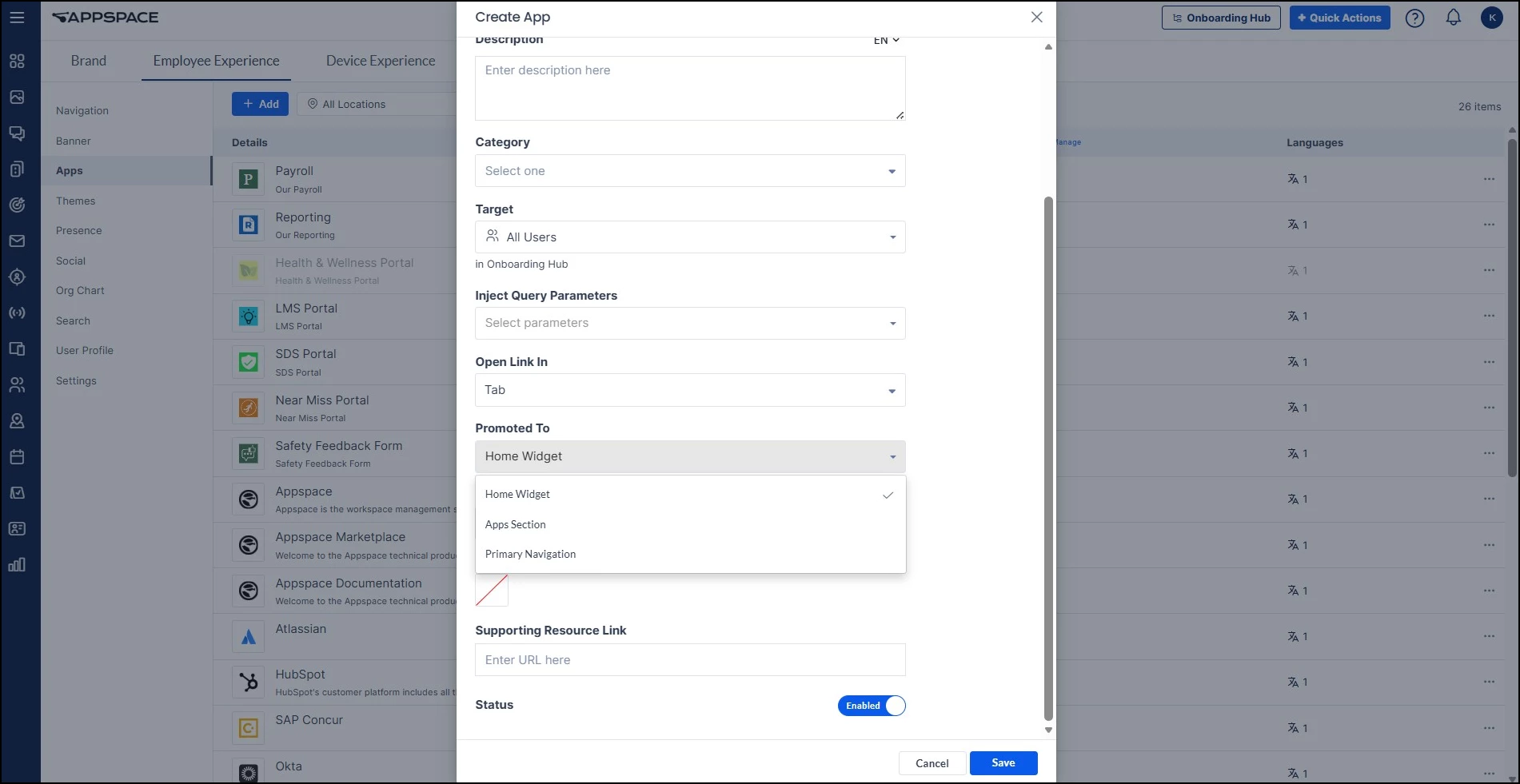
Step Two: Add the Link as an App
Go to Settings > Configuration > Employee Experience > Apps and add the copied link as a new App. When configuring the App, you can control where it appears in the Intranet. There are three visibility options:
- Homepage widgets only: The dashboard link appears in an App Links widget on the Intranet homepage, but not in the navigation
- Apps section: The dashboard link appears in the Apps area of the Intranet, accessible from the Apps navigation item
- Primary navigation: The dashboard link appears directly in the main Intranet navigation bar for maximum visibility
This is especially useful for giving teams access to performance data. For example, you could surface the intranet engagement dashboard so your communications team can monitor content performance directly from the Intranet, even if they don't have a platform license.