



Govern Your Brand Identity at Scale: A Guide to Brand Center for the Intranet
Large organizations, especially those with sub-brands or regional divisions, often style every homepage theme by hand, and colors, logos, and fonts drift apart over time. Brand Center gives you one place in Appspace to define each brand as a Brand Profile, with its own logos, color palette, typography, and interface styling. One profile is the account default, and homepage themes pick up a profile so employees see the right brand without anyone configuring it again.
This guide is for IT administrators and brand or communications owners who manage Appspace account configuration and Intranet homepage themes. You set each brand once, apply it to a homepage theme, and Intranet uses that brand.
Key Benefits
- Brand governance from one hub — Define logos, colors, fonts, corner styling, and device settings once per brand instead of re-entering them across themes and teams.
- Multiple brands in a single account — Sub-brands, regional divisions, and MSP-managed tenants each get their own Brand Profile, with one set as the account default.
- Automatic, consistent application — Intranet applies the brand set on each homepage theme.
- Accessible color choices — Contrast alerts flag low-contrast color combinations while you configure the brand, before employees see them.
- Lower administrative load — New Brand Profiles inherit from the default brand, so you only change what differs.
What This Guide Covers
- What a Brand Profile contains
- Opening Brand Center in the Admin Console
- Creating a Brand Profile and setting its name and logos
- Configuring the Design color palette
- Configuring Typography
- Configuring User Interface colors and corner styling (Border Radius)
- Reviewing Devices settings and why they come from the default brand
- Managing brand cards: edit, set as default, revert to system defaults, and delete
- Applying a Brand Profile to an Intranet homepage theme
- How Appspace decides which brand an employee sees
Prerequisites
- Account Owner permissions in the Appspace Admin Console.
- Access to Intranet homepage themes, if you plan to apply a brand to a theme.
- Your brand assets ready to upload: a dark logo, a light logo, and an icon. The panel recommends SVG or PNG at 200px × 80px for the dark and light logos, and SVG or PNG at 80px × 80px for the icon.
- A card logo, if you set one on the default brand: SVG or PNG at 200px × 80px.
- Your approved color values (accent, dark, light, background, plus any extended and data-visualization palette colors) and your chosen header and body fonts.
Steps
1. Understand what a Brand Profile holds
A Brand Profile is one stored visual identity for your account. Each profile holds:
- Name
- Logos — dark, light, and icon
- Colors — accent, dark, light, extended palette, and data-visualization palette
- User interface — background color, link colors and style, navigation colors, and corner styling
- Typography — header font and body font
- Device settings — card logo, card theme palette, and post device template
One Brand Profile per account is the Default.
Branding applies to Intranet, not to the Admin Console.
2. Open Brand Center in the Admin Console
- In the Admin Console, click the ☰ Appspace menu.
- Select Settings > Configuration.
- Click the Brand tab.
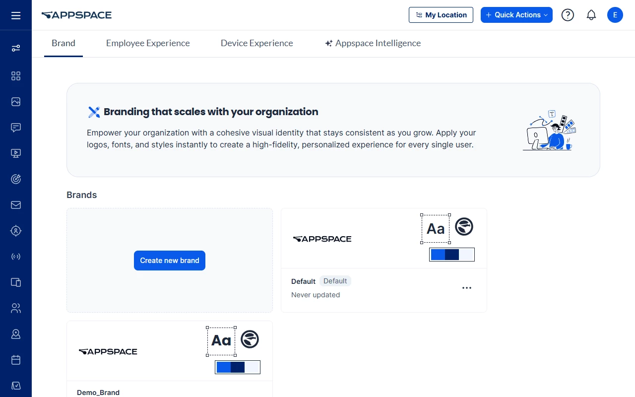
The page opens with a Branding that scales with your organization banner, then a Brands section listing your brands as cards. Each card shows the brand's dark logo, its font sample, its favicon, its accent, dark, and light colors, the brand name, and when it was last updated (Never updated until you save a change). The default brand card carries a Default badge. Click anywhere on a brand card to open that brand for editing.
3. Create a Brand Profile and set its name and logos
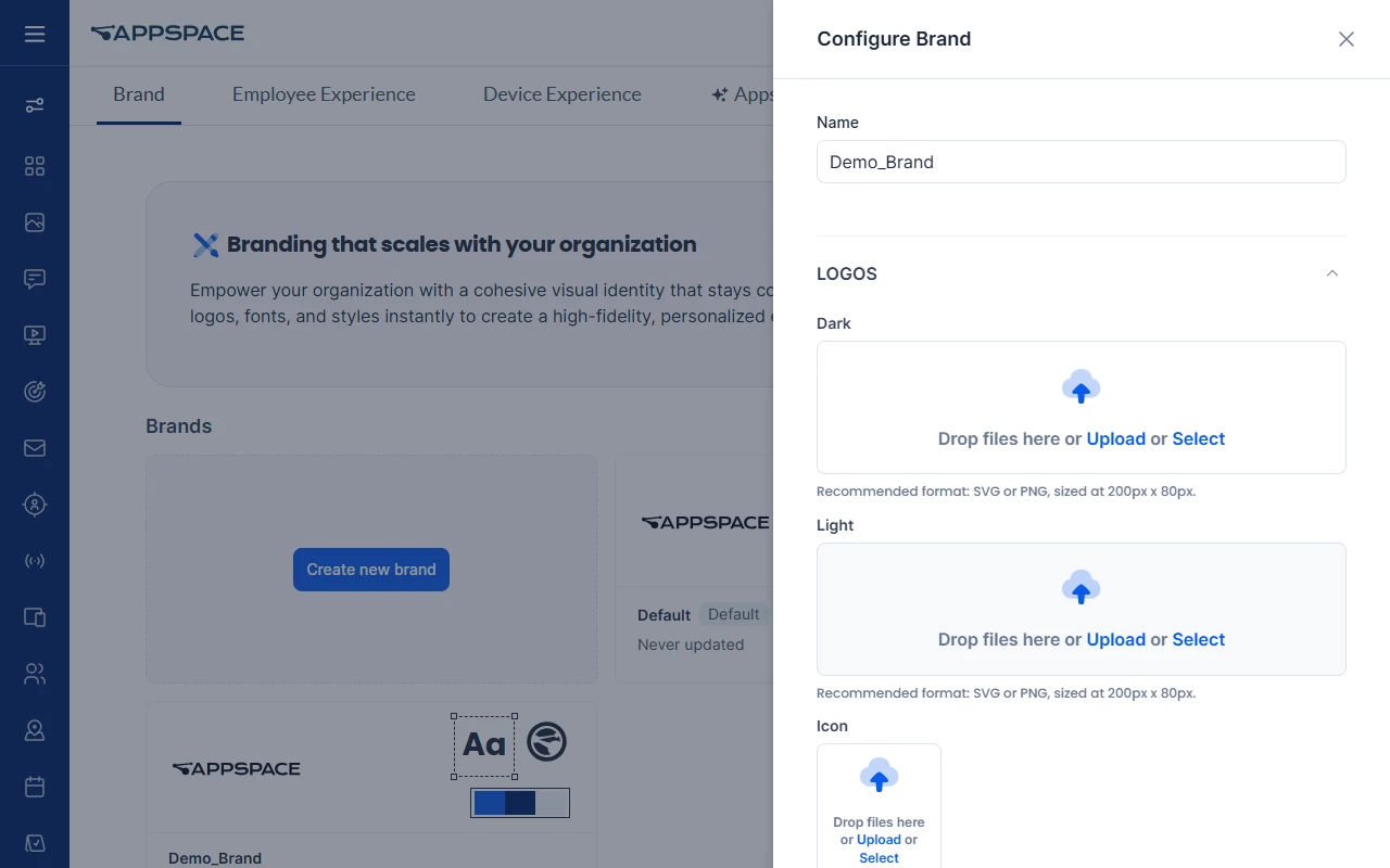
- On the Brand page, select Create new brand. The Configure Brand side panel opens.
- In the Name field, enter the brand name. Name is required, and the value is shown on the brand card.
- Expand LOGOS and add each logo. Every slot accepts a drag-and-drop file, an Upload, or a Select from your existing library:
- Dark — recommended SVG or PNG at 200px × 80px
- Light — recommended SVG or PNG at 200px × 80px
- Icon — recommended SVG or PNG at 80px × 80px
- Once a logo is set, restore and delete controls appear on the slot. Deleting a logo makes the profile fall back to the default brand's logo for that slot. Restoring re-inherits the logo from the default brand.
A new brand inherits its values from the default brand, so anything you do not change stays aligned with your primary identity.
4. Configure the Design color palette
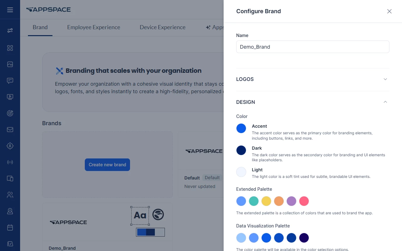
Expand DESIGN to set the brand's core colors.
Color
| Control | What the panel says it does |
|---|---|
| Accent | "The accent color serves as the primary color for branding elements, including buttons, links, and more." |
| Dark | "The dark color serves as the secondary color for branding and UI elements like placeholders." |
| Light | "The light color is a soft tint used for subtle, brandable UI elements." |
Extended Palette — "The extended palette will be available in the color selection options."
Data Visualization Palette — "Colors designed for clarity and consistency in charts and data visualizations."
On the existing default brand these keep their current values. On a new brand they are inherited from the default.
Contrast alerts run while you pick colors. When low contrast is detected, an exclamation mark icon appears beside the field name; hover it to see the tooltip. The Light color is decorative and does not raise a contrast alert.
Background Color is under USER INTERFACE (step 6).
5. Configure Typography
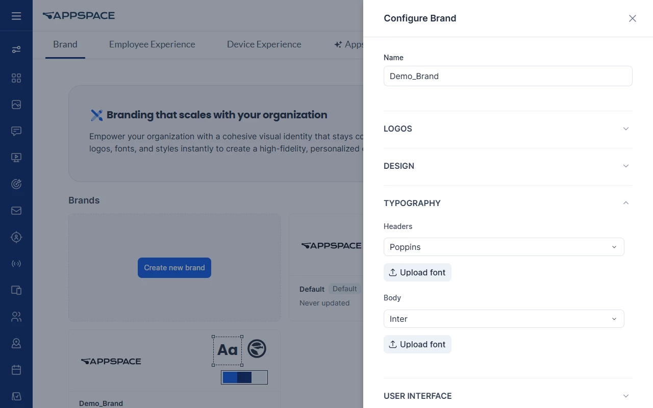
Expand TYPOGRAPHY to set the brand's fonts:
- Headers — pick a font from the dropdown, or select Upload font to supply your own.
- Body — same dropdown and Upload font option.
Each font starts with the value inherited from the default brand. An inherited value shows a link icon with a hover tooltip. A changed value shows a restore button that returns the field to the default brand's font. Poppins is in the built-in font list, and Inter is the body font on a new default brand.
Link Style is under USER INTERFACE (step 6).
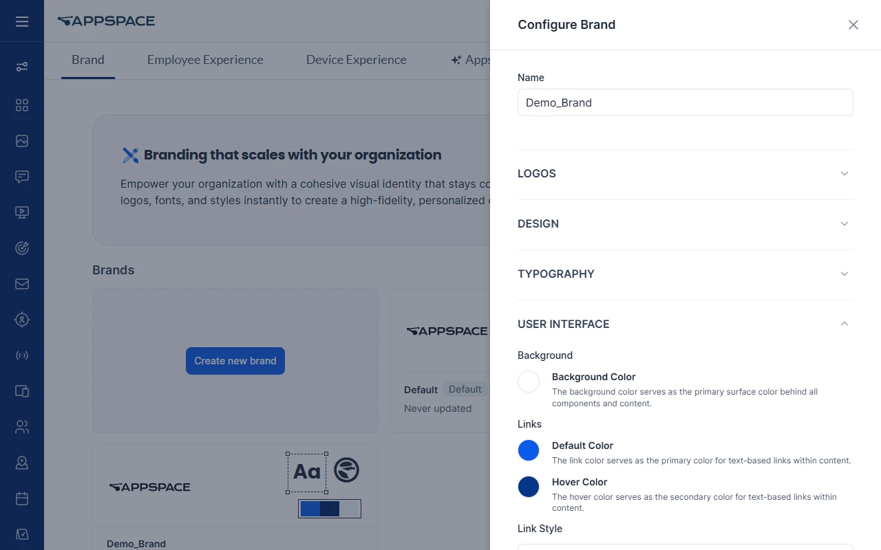
6. Configure User Interface colors and corner styling
Expand USER INTERFACE. This section holds the background color, link and navigation colors, and corner styling.
Background
- Background Color — "The background color serves as the primary surface color behind all components and content."
Links
- Default Color — "The link color serves as the primary color for text-based links within content." It starts as the Accent color and can be overridden. It applies to inline hyperlinks, View All widget links, and breadcrumbs.
- Hover Color — "The hover color serves as the secondary color for text-based links within content." By default it is a darker version of the link color that meets a recommended WCAG contrast target (6.0:1 or 7.0:1).
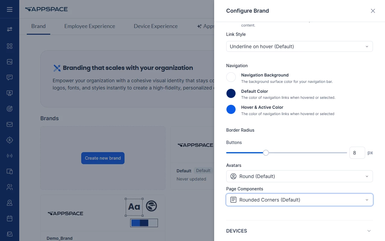
- Link Style — defaults to Underline on hover (Default).
Navigation
- Navigation Background — "The background surface color for your navigation bar."
- Default Color — the resting color of navigation links.
- Hover & Active Color — "The color of navigation links when hovered or selected." It starts as the Accent color.
Border Radius
Scroll further down the same section for corner styling:
- Buttons — a slider with a pixel value (8 px on a default brand).
- Avatars — Round (Default), Rounded Corners, or Square.
- Page Components — Rounded Corners (Default) or Square.
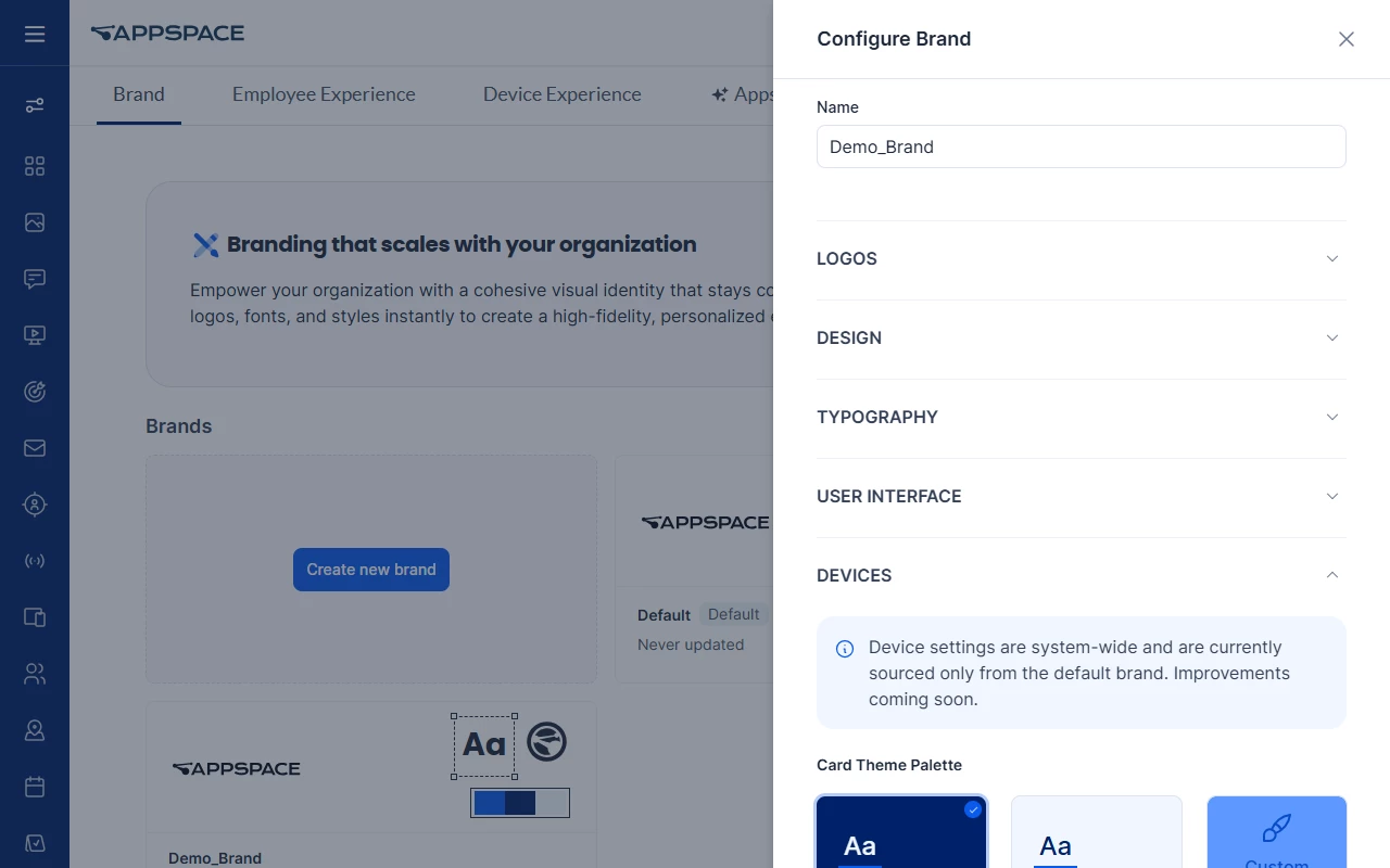
7. Review the Devices section
Expand DEVICES. An information callout says ‘Device settings are system-wide and currently sourced only from the default brand.’
- Card Logo — SVG or PNG at 200px × 80px, on Dark, Light, or Custom.
- Card Theme Palette — Dark, Light, or Custom
- Post Device Template — a template for each Post Type: Text Only, Image, Multiple Media, Event, and Story
Cards use the Card Logo, palette, and post templates from the default brand only.
8. Save the brand
Click Save. The new brand card appears in the Brands list with its name and an Updated … timestamp.
9. Manage brand cards from the ellipsis menu
Each brand card has an ellipsis (⋯) menu. On a non-default brand card it offers four actions, in this order:
- Edit — opens the Configure Brand panel.
- Set as default brand — moves the brand to the first position, replaces the previous default, and shows the Default badge. A Change Default Brand confirmation explains the system-wide impact; click Change to continue or Cancel to stop.
- Revert to system defaults — opens a Revert to system defaults? confirmation with Cancel and Revert. Confirming resets the brand to the Appspace system defaults, including the out-of-the-box Appspace logo rather than your default brand's logo.
- Delete — opens a Delete confirmation dialog that warns the action cannot be undone, with Cancel and Delete.
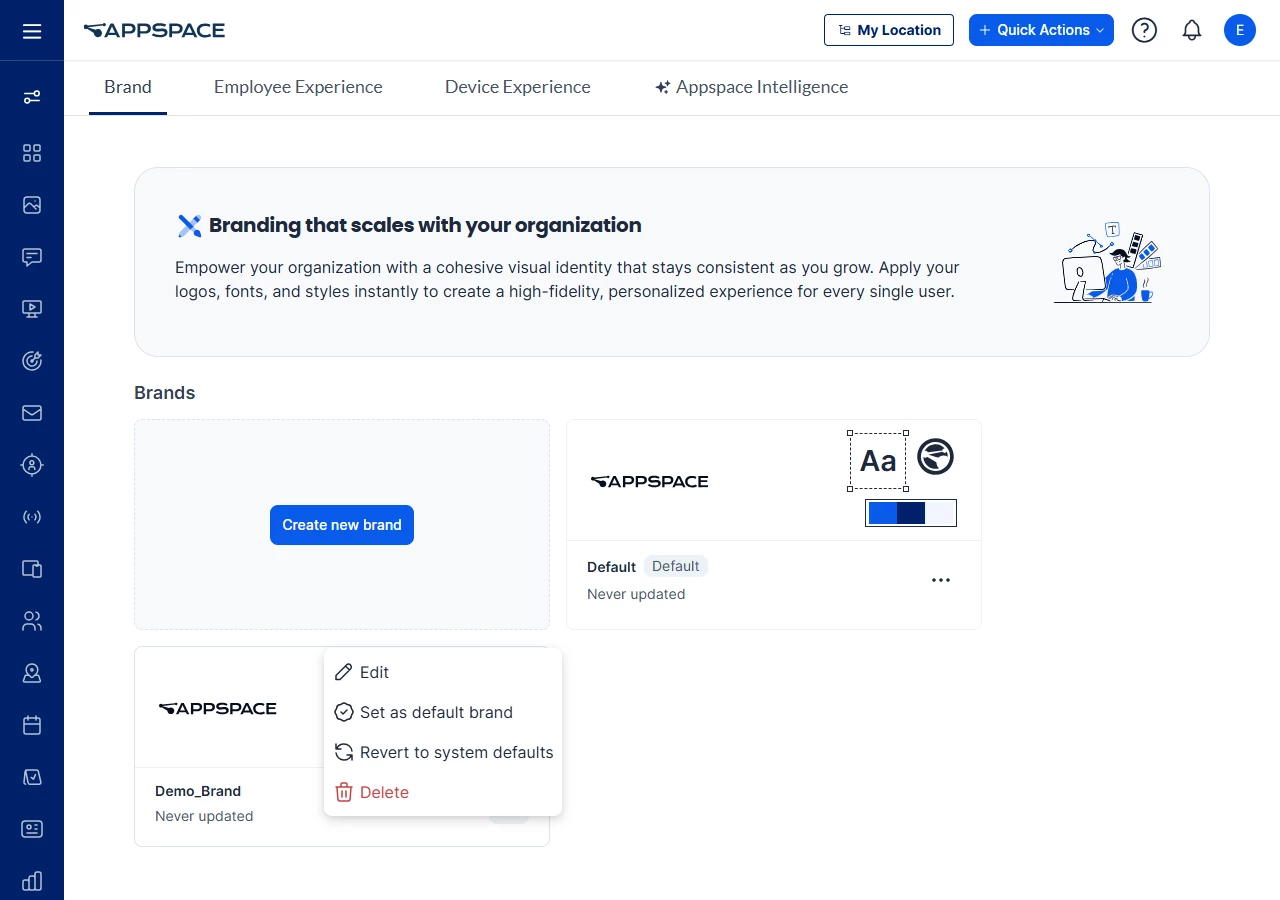
The default brand card's menu shows only Edit and Revert to system defaults. The default brand cannot be deleted.
Revert and delete each show a notification when they succeed or fail.
10. Apply a Brand Profile to an Intranet homepage theme
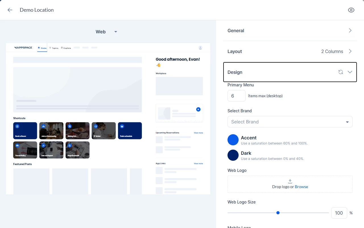
- Open the homepage theme you want to brand and expand Design.
- In Select Brand, choose a Brand Profile. The dropdown is empty by default, and while it is empty the theme's own Accent and Dark color pickers are shown.
- Once a brand is selected, those color pickers are hidden and the values come from the brand.
- The selected brand's name appears on the theme card.
- Save the theme.
Logos on themes:
- New theme, brand selected — web and mobile logos come from the brand.
- New theme, no brand selected — logos come from the default brand.
- Existing theme, brand selected — web and mobile logos come from the brand.
- Existing theme, no brand selected — existing logos are kept.
The theme's Design section also has Web Logo, Web Logo Size, and Mobile Logo, so a theme can override the brand's logo.
Alternatives — clearing the brand selection
Clear the Select Brand field to remove the brand from the theme. The theme's own color pickers return.
11. Understand which brand an employee sees
Intranet chooses the brand in this order:
- If the employee's homepage theme has a Brand Profile selected, that brand is used.
- If the theme has no brand selected, the theme's own colors and logos are used, and everything else comes from the account's default Brand Profile.
- If no Brand Profiles exist, the account's previous global brand settings are used.
When a theme has a brand selected, every brand setting applies except web and mobile logos that are set separately on the theme.
Logos fall back in this order: the theme logo, then the logo of the brand selected on the theme, then the default brand logo, then the Appspace default logo.
12. Verify what employees see
- Sign in to Intranet (or use a test account) on a theme that has your brand applied.
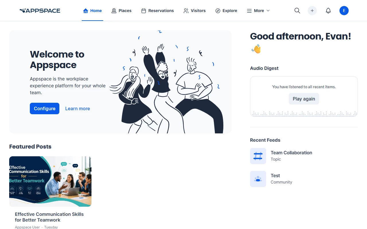
- Confirm the navigation logo, navigation background, link colors, header and body fonts, and corner styling match the Brand Profile.
- Confirm the Admin Console is not branded.
- Check Intranet on mobile as well as on desktop.
Use Case
Scenario: A holding company runs three regional sub-brands from one Appspace account.
The IT administrator opens the Brand tab and creates three Brand Profiles: the corporate brand, set as the account default, and one profile per region. Because each new profile inherits from the default, the administrator only overrides what differs — the dark and light logos, the accent color, and the header font — and leaves shared values such as the extended palette and border radius alone. A contrast alert flags a low-contrast link color on one regional palette, and the administrator adjusts it before saving.
The administrator then opens each regional homepage theme and picks the matching brand in Select Brand. The theme's own color pickers disappear, the theme card shows the brand name, and employees on that theme see the correct logo, palette, fonts, and corner styling. Device card templates continue to come from the corporate default brand. When corporate refreshes its accent color the following quarter, the administrator edits one Brand Profile and every theme that uses it follows.
Best Practices
- Set your primary corporate identity as the default brand first, then create sub-brands so inheritance does the repetitive work.
- An inherited value follows later changes to the default brand. Override only the values that differ per sub-brand.
- Check each brand on Intranet for desktop and mobile before announcing the change internally.
Troubleshoot
| Symptom | Likely cause | What to try |
|---|---|---|
| The Brand tab shows a single brand page with no brand cards | The account is not on Appspace platform 2604.2.0, or it still uses the previous brand page | Confirm the account is on 2604.2.0. If the Brand tab still shows the previous page, contact Appspace Support |
| The theme's Accent and Dark color pickers are missing | A brand is selected on the theme | Clear Select Brand to use the theme's own colors, or change the colors on the Brand Profile |
| Navigation logo renders blank | No logo is set at any level of the logo fallback | Add a logo on the theme, the selected brand, or the default brand |
| Logo overlaps or crowds the navigation bar | Logo supplied outside the recommended dimensions | Re-export at 200px × 80px (dark and light) or 80px × 80px (icon) |
| Brand fonts or component styling appear in the Admin Console | Branding is applied only to Intranet | Report it to Appspace Support with the page where it appears |
| Device, card logo, or card template changes on a sub-brand have no effect | Device settings are system-wide and currently sourced only from the default brand | Make the change on the default brand |