


Custom Widget Support for Channels and Topics
This update extends Appspace’s widget management system to both Channels and Topics. Publishers and Administrators can now add, configure, reorder, and remove widgets to create personalized audience experiences. Using a unified Shared Widget Architecture, the platform ensures consistent management across all content areas.
Channel Customization
Publishers can now tailor the Channels page using the same capabilities previously found only in Communities.
- Unified Management: Access a new Widgets tab within Channel Settings to manage the Feed and Sidebar areas.
- Flexible Layouts: Standard elements like About, Insights, Followers, and Tags are now modular. They can be reordered, disabled, or supplemented with new widgets.
- Expanded Widget Set: Supports the full suite, including Banners, Shortcuts, Org Chart, Web Frame, Ask AI, and Custom Widgets.
Topic Page Enhancements
Topic pages now feature a modular, drag-and-drop infrastructure instead of static layouts.
- Full Operations: Use the Widgets tab in the Topic menu to Add, Edit, Delete, or Reorder elements.
- Smart Defaults: Topics include built-in Insights and Tags sidebar widgets. These are protected from accidental deletion to maintain core functionality.
- Consistent Interface: Maintains the established two-column (Feed and Sidebar) layout for a familiar user experience.
Advanced Custom Widgets & API
Appspace now supports third-party Custom Widgets built with the new Widget API.
- Seamless Integration: Widgets are added via a picker, rendered in secure iframes, and support complex configurations like authentication keys.
- Developer Resources: A new TypeScript library (packages/widget-api/) allows custom applications to communicate with the Appspace Console.
- AI Tooling: Includes AI-powered generation to accelerate the creation of complete widget projects.
Configuring custom widgets on a channel and topic
- Login to Appspace.
- On the Home page, click More > Channels or Topics to show all channels or topics.
- Select the desired channel or topic to add the custom widget.
- On the channel or topic page, click Settings on the left pane.
- On the Settings window, click Widgets.
- Click Add Widget to add a new widget.
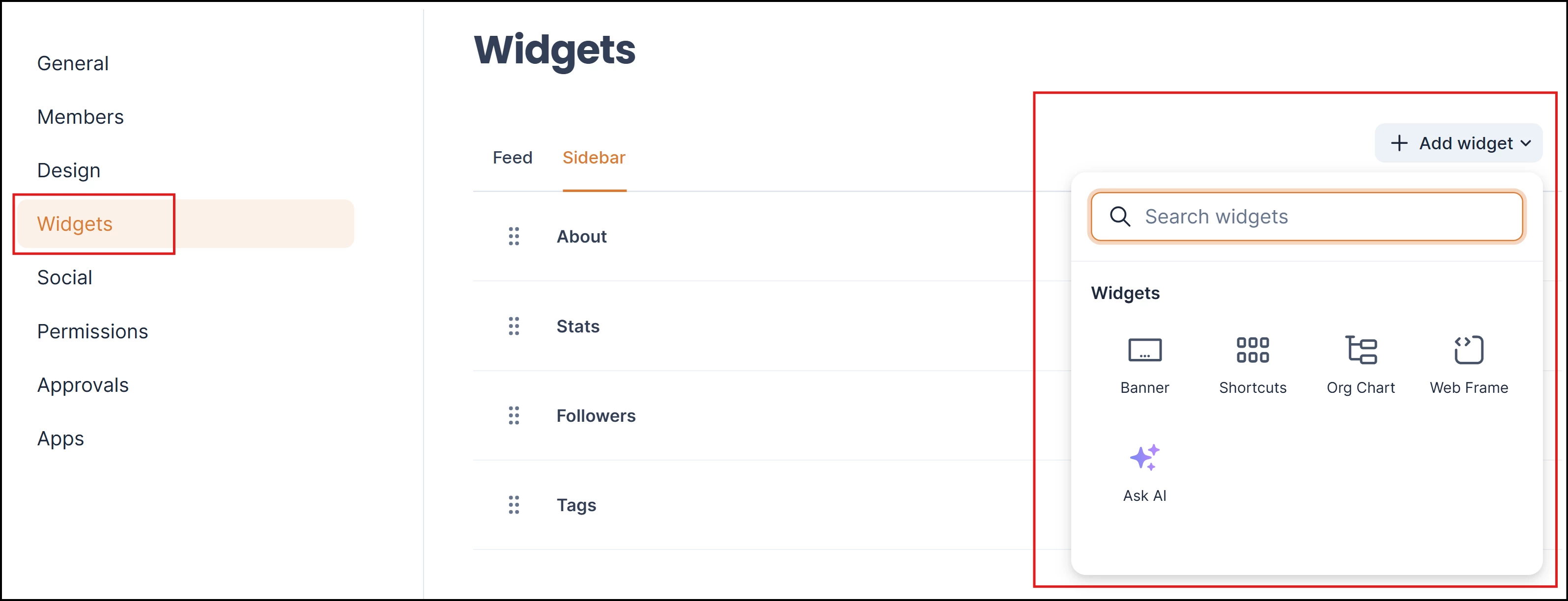
- Select among the following widget types:
- Banner
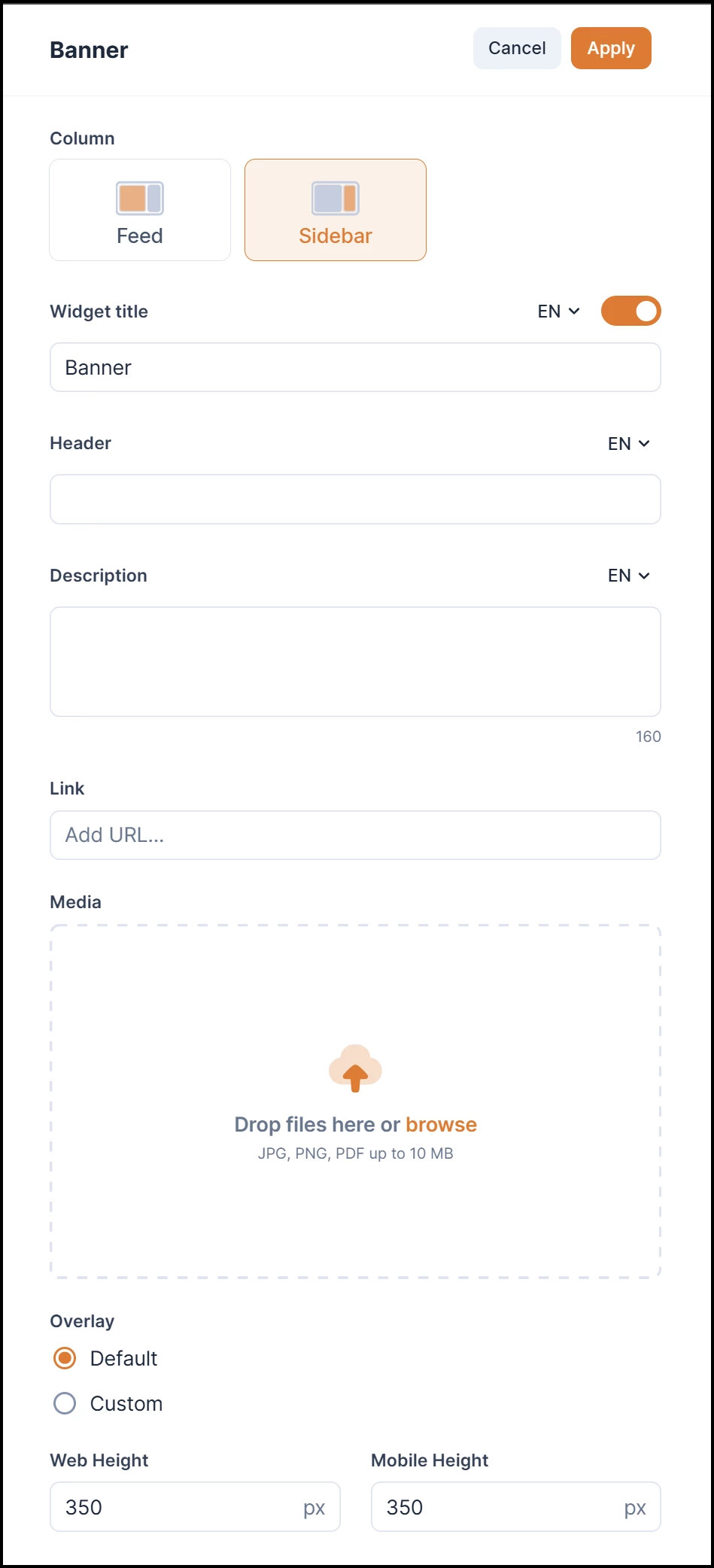
- Shortcuts
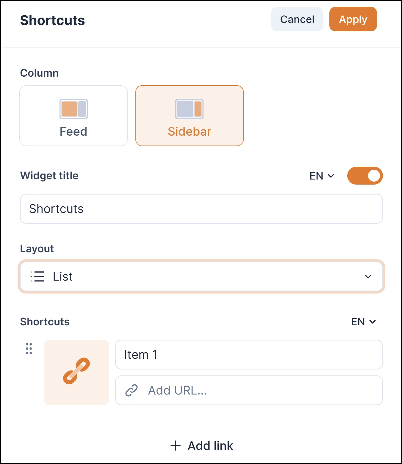
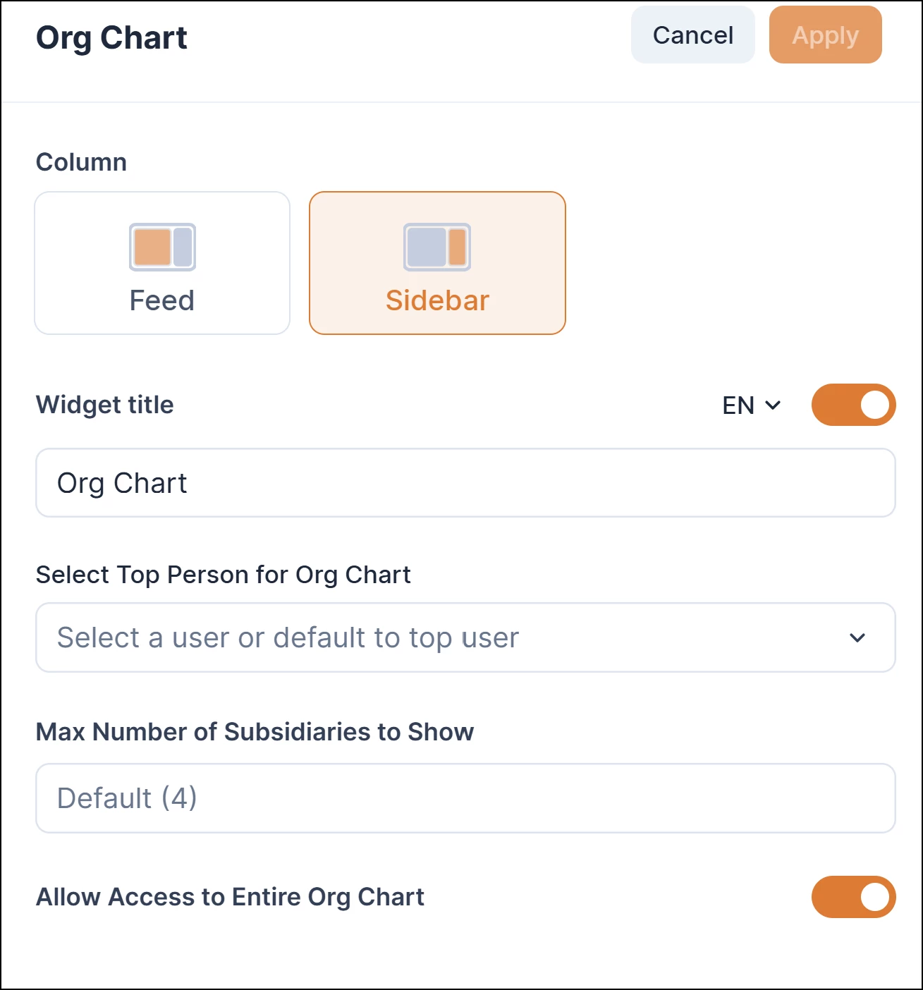
- Org Chart
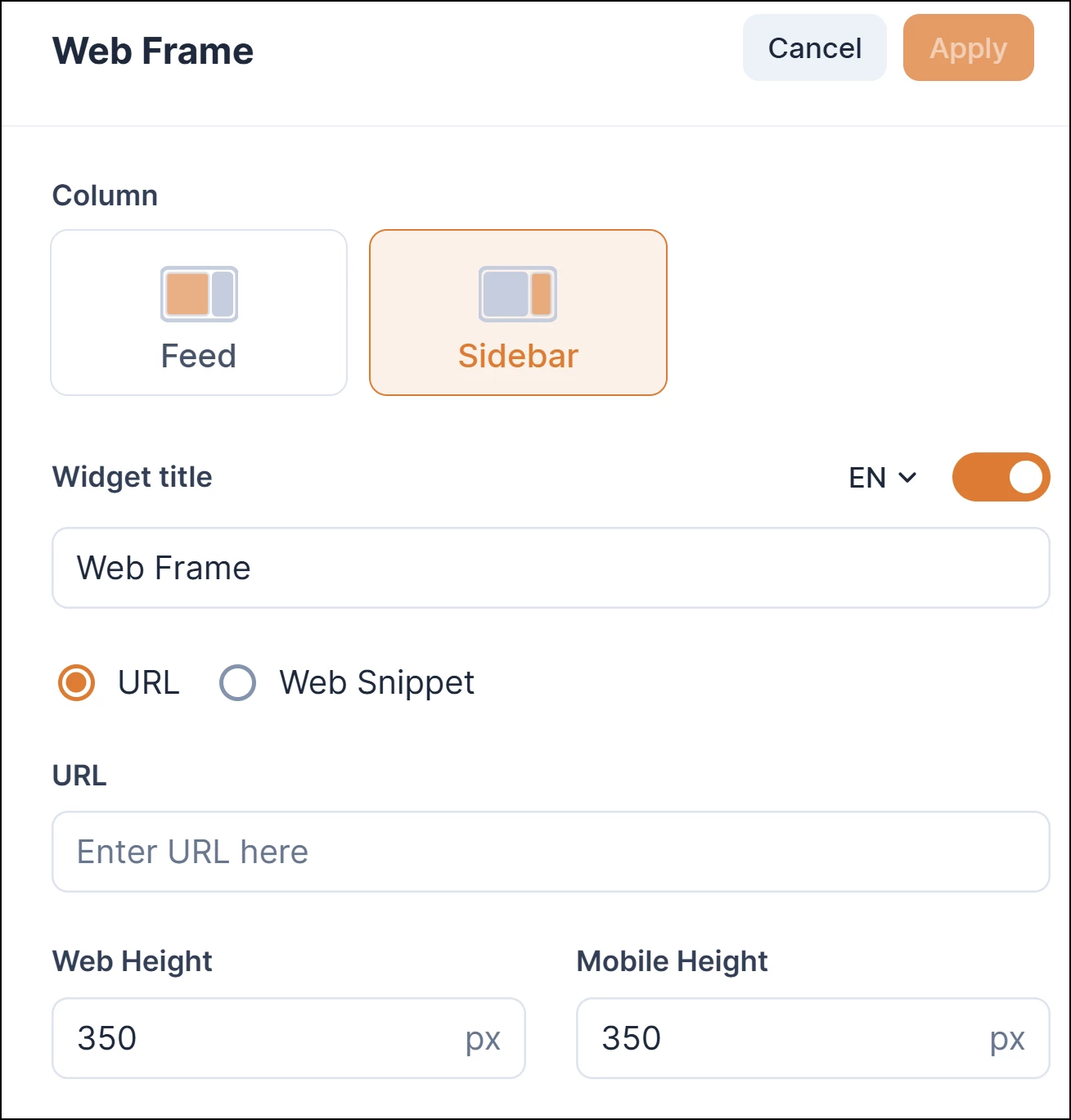
- Web Frame
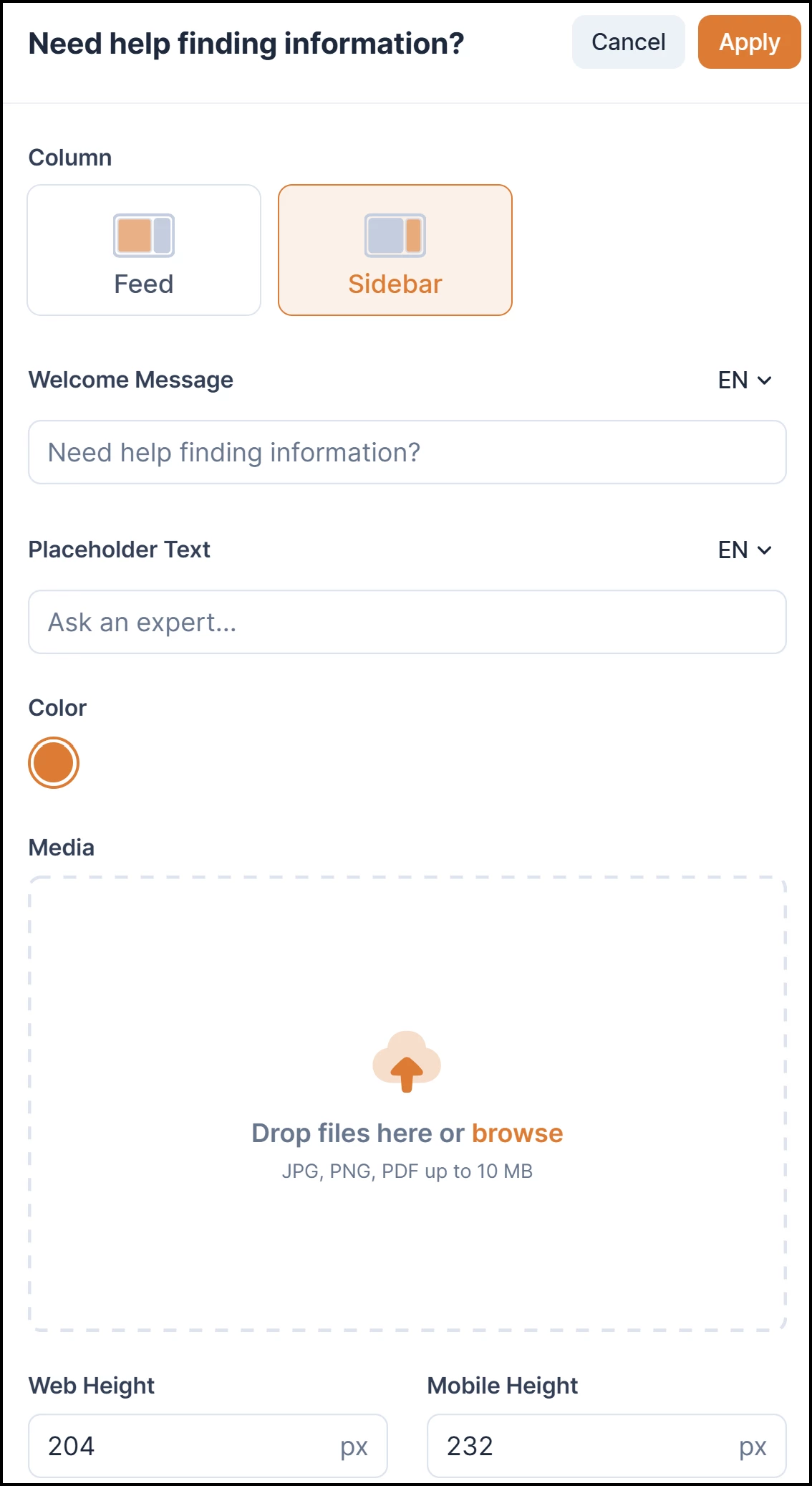
- Ask AI
Configuring Home Theme Widget: Text Block
This widget leverages a streamlined editor to provide a lightweight, text-focused content area. Users can format and style text using existing editor capabilities, though media embedding (images, video, etc.) is not supported in this initial release.
Adding the Text Block Widget
Users can add a "Text Block" widget directly from the widget picker:
- On the Home page, click Configure.
- On the Settings page, close the right pane if necessary.
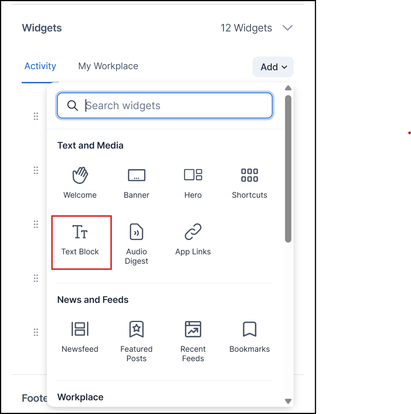
- Expand Widget and click Add.
- Select Text Block.
Editing and Formatting Content
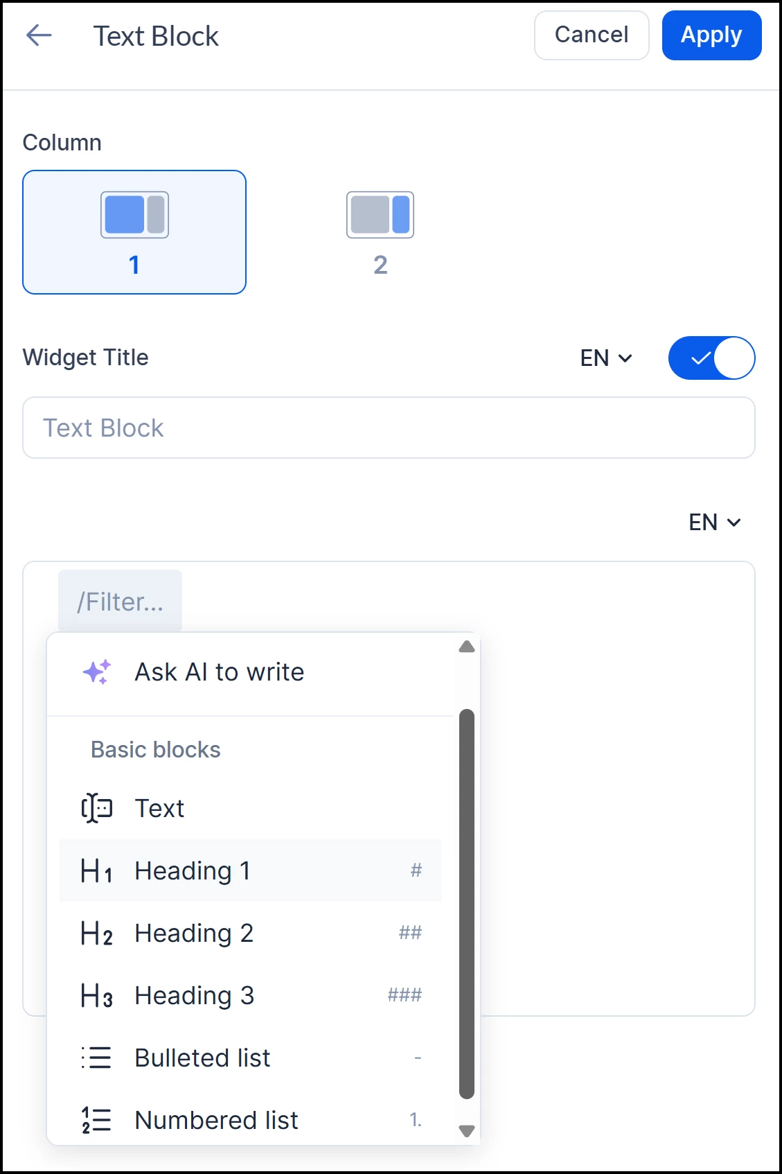
Users can enter and format text using the cut-down editor:
- Click the ellipses and select Edit.
- Add a Title for the widget.
- Type the symbol "/" for additional commands and AI assist.
- Note: Media and image options are unavailable in the editor for this specific widget.
Display and Persistence
- The widget renders correctly on the Home Page and in Spaces.
- All content persists reliably across page loads.
Adding Calendar View to Upcoming Events Widget
Appspace is enhancing the Upcoming Events widget within the Home theme to include an interactive calendar view. This update introduces a dynamic date-picking interface with visual indicators and real-time event filtering, leveraging the platform's modular infrastructure to improve how users discover and manage scheduled activities.
- On the Home page, click Configure.
- On the Settings page, close the right pane if necessary.
- Expand Widget and click Add.
- Select Upcoming Events.
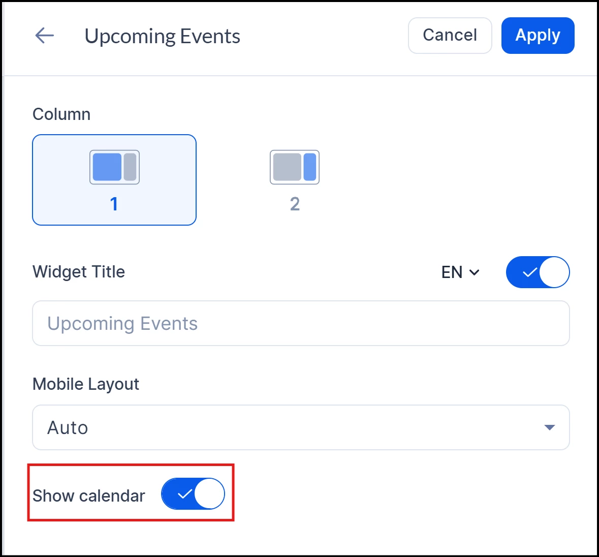
- Click the ellipses and select Edit.
- Add a Title for the widget.
- Toggle the Show calendar setting on.
Calendar Display
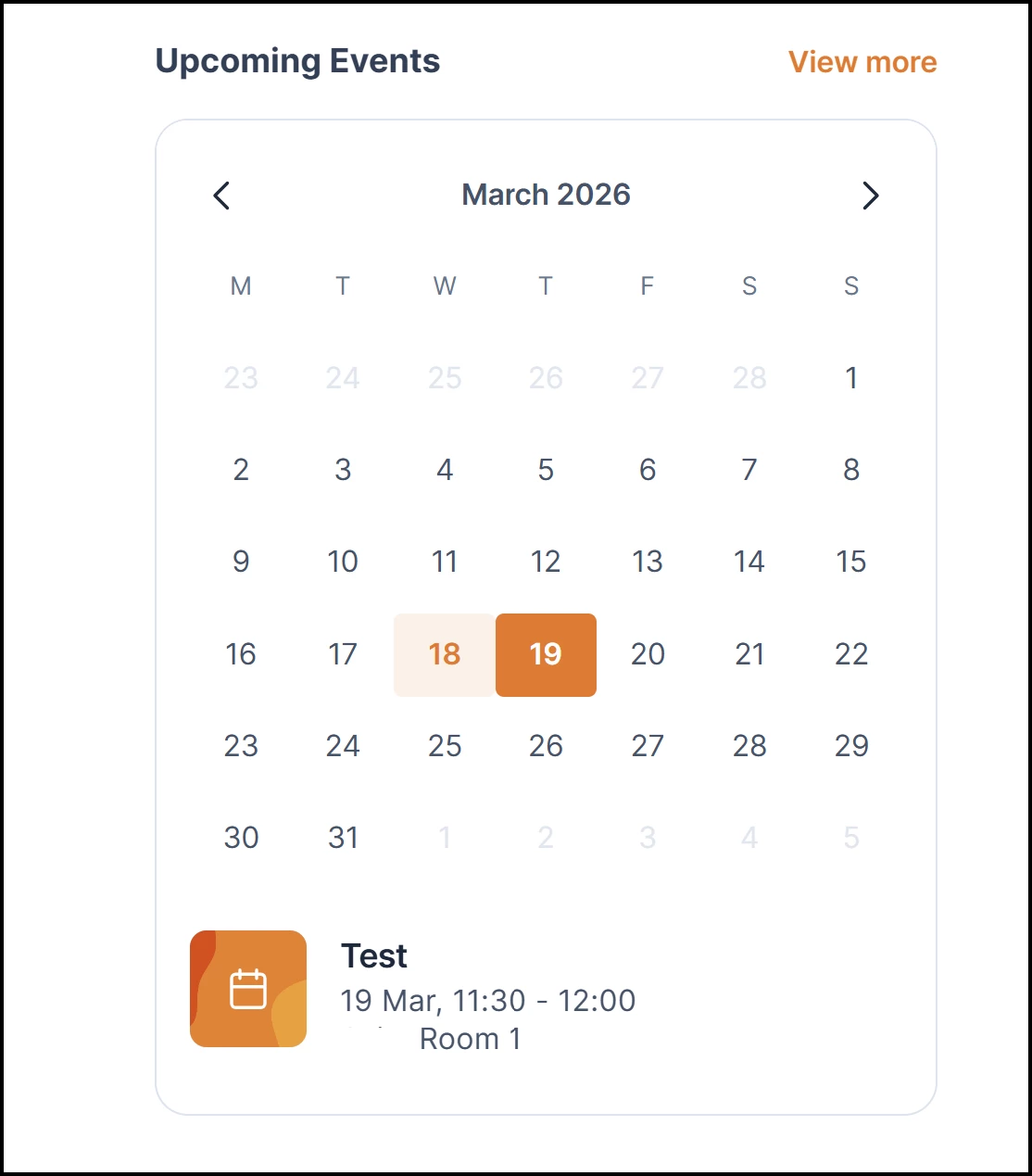
The widget now features a structured calendar display designed for intuitive navigation:
- Default View: The calendar displays the current month by default when the page loads.
- Navigation Header: A month/year header is displayed, accompanied by navigation arrows to browse previous and next months.
- Standardized Layout: Days of the week headers (M, T, W, T, F, S, S) are clearly shown to ensure a familiar user interface.
- Event Indicators: Visual indicators, such as dots, automatically appear on dates with scheduled events to provide an immediate summary of upcoming activity.
Date Selection & Filtering
The calendar serves as a functional tool for personalizing the event feed:
- Interactive Selection: Users can click on any date within the calendar grid.
- Visual Feedback: The selected date is visually highlighted to maintain clear user context.
- Dynamic Results: The event list positioned below the calendar updates immediately to show only the events occurring on the selected date.
- Empty States: Selecting a date without any scheduled events will display an appropriate empty state.
Responsive Sizing & Integration
To ensure a consistent management and viewing experience, the calendar is built on a unified architecture:
- Functional Layouts: The calendar and event list remain fully functional and responsive across different screen sizes.
- Events Page Enhancements: A calendar widget and date picker are integrated into the dedicated Events page.
- Global Indicators: Visual indicators (dots) and date-click filtering are consistently applied to the Events page to help users find content efficiently.