
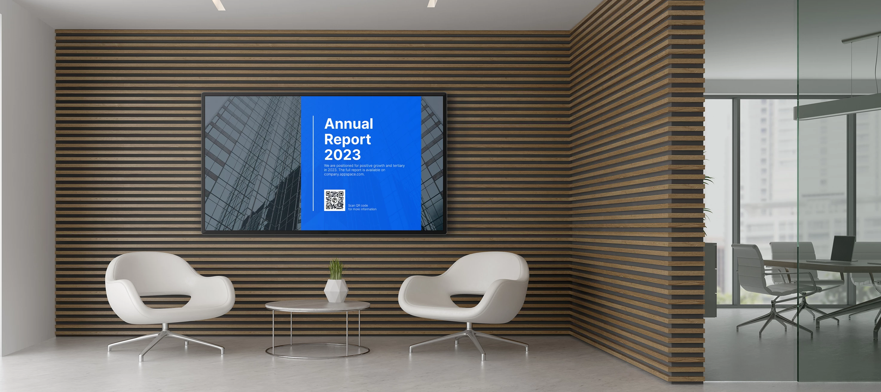


Accessibility Checklist for Digital Signage
A deliberate and thoughtful approach to accessibility helps guarantee that everyone, regardless of their abilities, has the same opportunities and access. This includes guidance on how devices should be set up and used in the workplace. While this checklist is based on requirements of The Americans with Disabilities Act (ADA), anyone can use it to help visitors or employees understand and interact with your digital signage.
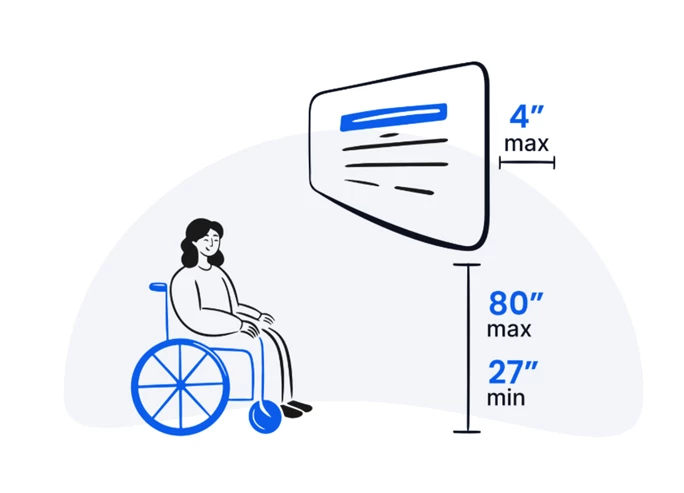
#1: Is Your Device Mounted or Placed Correctly?
The height and placement of your device can greatly affect its visibility. When setting up your device, make sure it follows these requirements.
- Maximum Height — Between 27 inches and 80 inches off the ground
- Minimum Depth — Protrudes less than 4 inches from the wall if mounted
Note: If your digital signage is also used as a kiosk, your screen must have a front reach of 20 inches and a side reach of 10 inches. Ground clearance around your kiosk must be at least 30 inches by 48 inches.
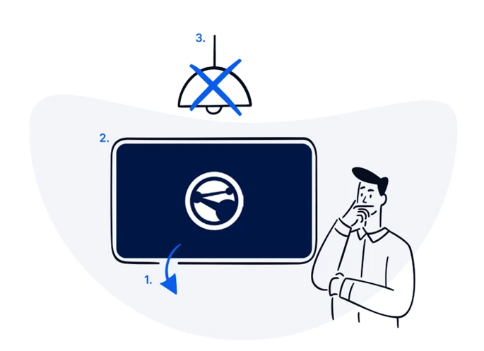
#2: Is There Any Glare on Your Screen?
Visually impaired people can have trouble processing glare or reflection on a screen. Use these techniques to reduce glare on your signage.
- Adjust the display's tilt
- Avoid lighter background colors
- Use indirect lighting rather than overhead lighting
#3: Is the Design of Your Content Accessible?
Don't assume everyone sees content on the screen similarly. Even the colors you choose for your digital signage content can affect your design's contrast and readability for color-blind or visually impaired users.
Contrast
To meet ADA requirements, your content needs to have at least a 70% contrast ratio. For example, a dark blue background with white text will have better contrast than a light blue background with white text.
Check your content's color contrast using the WebAIM Contrast Checker.
Color Combinations
Certain color combinations are not accessible for color-blind users. Keep these common types of color blindness in mind when designing content.
- Red/Green color blindness — The most common type; avoid green on red or red on green
- Blue/Yellow color blindness — Avoid combinations that rely solely on these two colors to convey meaning
- Complete color blindness — Avoid using color alone to direct or relay information
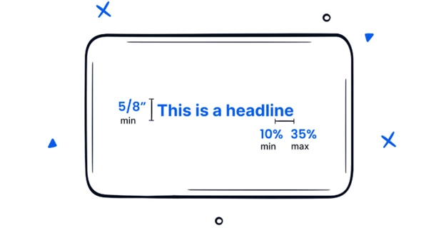
#4: Is the Text on Your Screens Legible?
Not all text reads the same, and small or stylized text can be particularly difficult to understand. To ensure readability, consider your text's font style, size, and spacing.
- Style — Avoid stylized, decorative, or handwritten fonts
- Size — Characters must be at least 5/8 inches in height
- Spacing — Character spacing must be at least 10% and at most 35% of the character height, measured between the two closest points of adjacent characters in the same word
#5: Are There Any Other Accommodations You Can Include?
Accessibility is not a one-size-fits-all solution. Different people may require different accommodations for their disabilities. Check in with your employees to see if there are additional accessibility features you can provide for their specific needs.
While following these guidelines is essential, consider enabling these additional features where possible.
- Screen readers
- Headphone jacks for sound output
- Magnifying or zoom options
- Color combination choices
For more details on ADA standards and guidelines, visit the U.S. Access Board - Chapter 7: Signs.