
Global Branding for Cards: User Guide
Introduction
With the Global Branding for Cards capability, your organization’s branding is automatically applied whenever Publishers create a new card, which streamlines the authoring process.
This capability ensures brand consistency across your organization's content.
Key Benefits
Using Global Card Branding offers several benefits:
- Effortless Brand Consistency: A unified brand identity is established with the automatic application of branding.
- Centralized Brand Control: The feature ensures that newly created cards adhere to established guidelines.
- Streamlined Content Creation: It reduces the time and effort needed to create a new, brand-compliant card.
What This Guide Covers
This guide will cover the following topics:
- Navigating the Global Brand Center
- Editing the Card Theme Palette
Prerequisites
Before you can configure Global Card Branding, you need to meet the following requirements:
- You must have a platform license.
- You must have an Account Owner role.
Configuration and Usage
Step One: Configuring Branding in the Global Brand Center
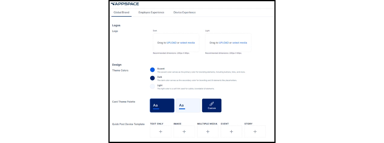
The Global Brand Center is the location where key aspects of your organization’s brand can be configured and applied to brandable elements across the platform.
Note: An exception to this is any home page themes for the Employee Experience that have different branding enabled.
To add and configure your global branding:
- Navigate to Settings > Configuration > Global Brand.
Configurable Elements
These are the elements that can be configured in the Global Brand Center:
- Logo: Light and dark versions of your logo, which can be uploaded as either PNG or SVG files.
- Theme Colors: Light, dark, and accent colors, which are selected from a color picker using hex codes.
- Fonts: Fonts for both header and body text, which can be chosen from the menu of default typefaces or uploaded.
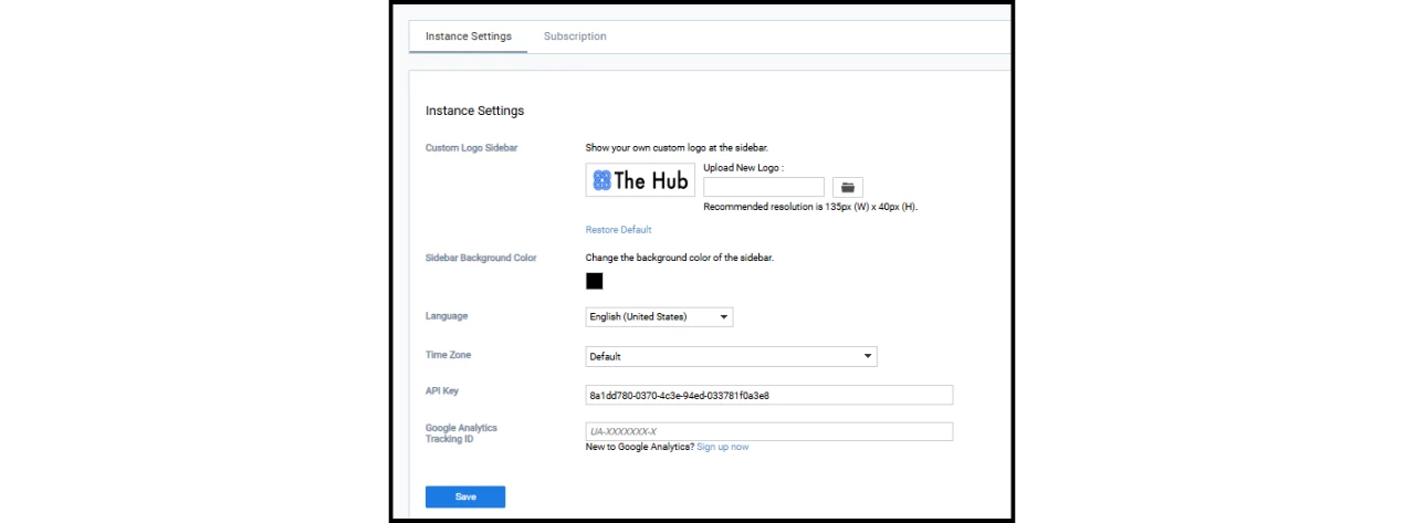
The navigation panel’s color and the console’s logo can also be edited in Settings > Account Settings > Instance Settings.
Step Two: Editing the Card Theme Palettes
The Card Theme Templates automatically apply a chosen palette to newly created cards.
Available Palettes
Three palettes are available for selection:
- Dark and Light palettes: These utilize your theme colors.
- Custom palette: This allows new card branding to differ from the platform branding.
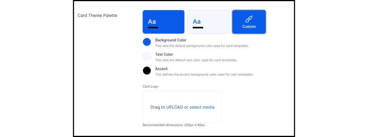
To edit the custom card theme palette:
- Click the Custom button.
- For each color, either select from the color picker or enter a hex code.
- Upload a new file or select from existing media to add a logo specific to cards.
Important Note: Any custom card templates—developed either by Appspace Services or another developer—can override the selected card theme palette.